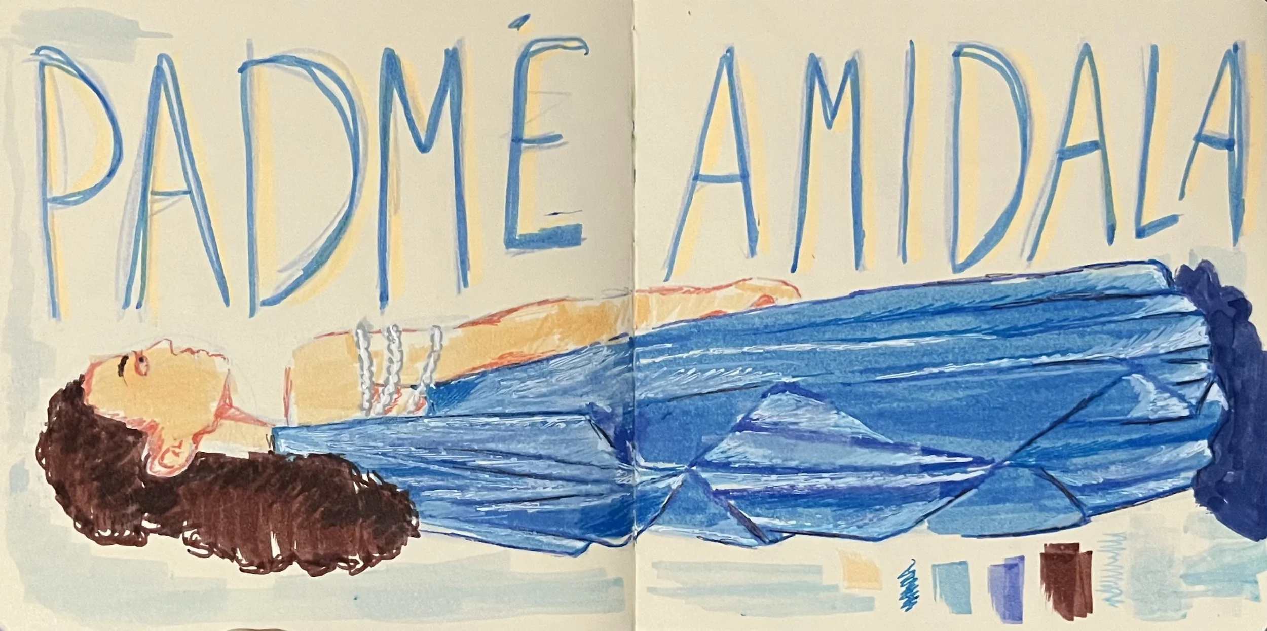
DRAWINGS AND PAINTINGS
♡
DRAWINGS AND PAINTINGS ♡


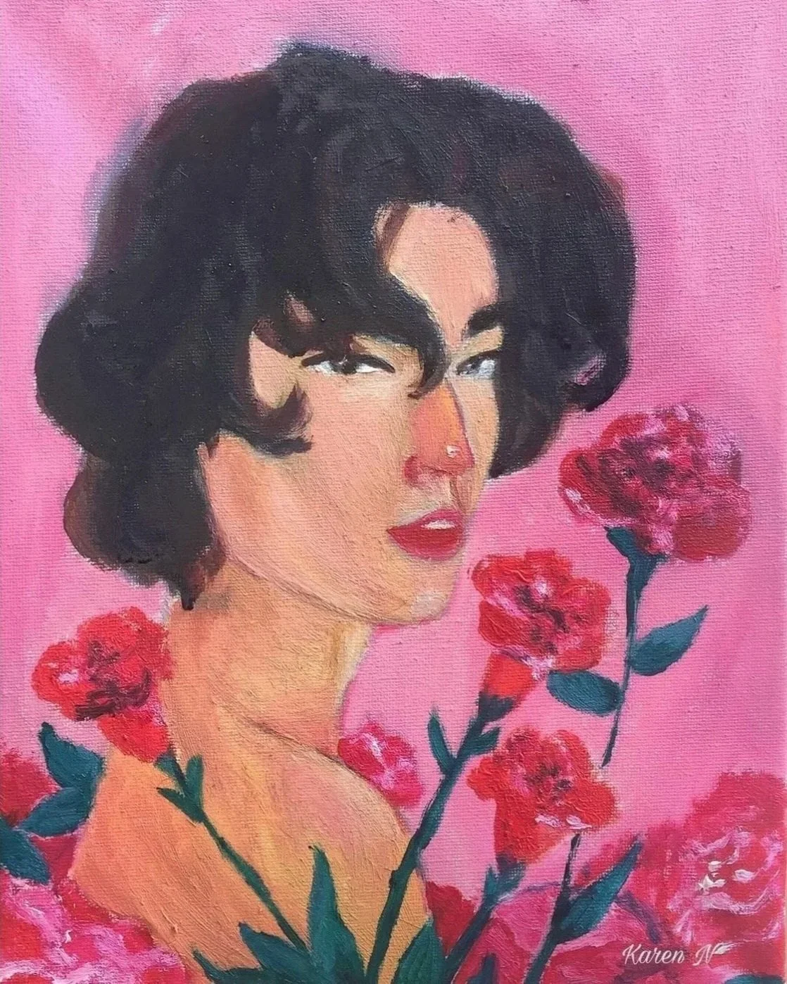
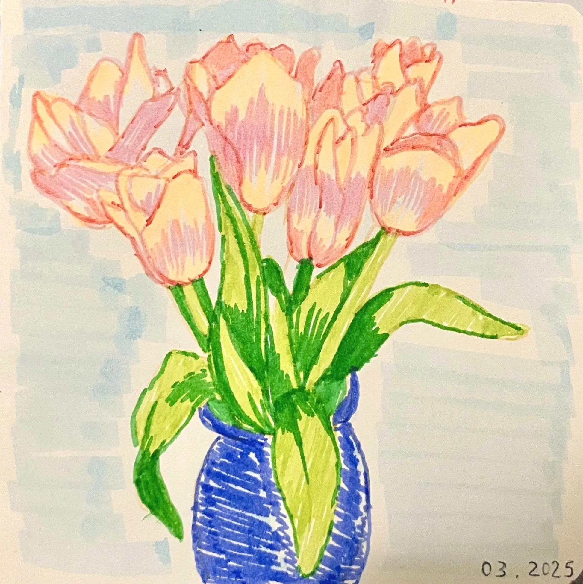
BLOOM
Oil Painting on Canvas, 9 x 12
This was my first time using oils, and I decided to paint my favourite musical artist at the time, Conan Gray. As a teenager, his music really spoke to me because his lyricism, production, and overall creativity really encouraged me to keep in touch with my creative work, and express myself through it. The flowers in this painting represent my growth throughout this season of my life, and the pinks and reds represent the the brightness of my life at that time.
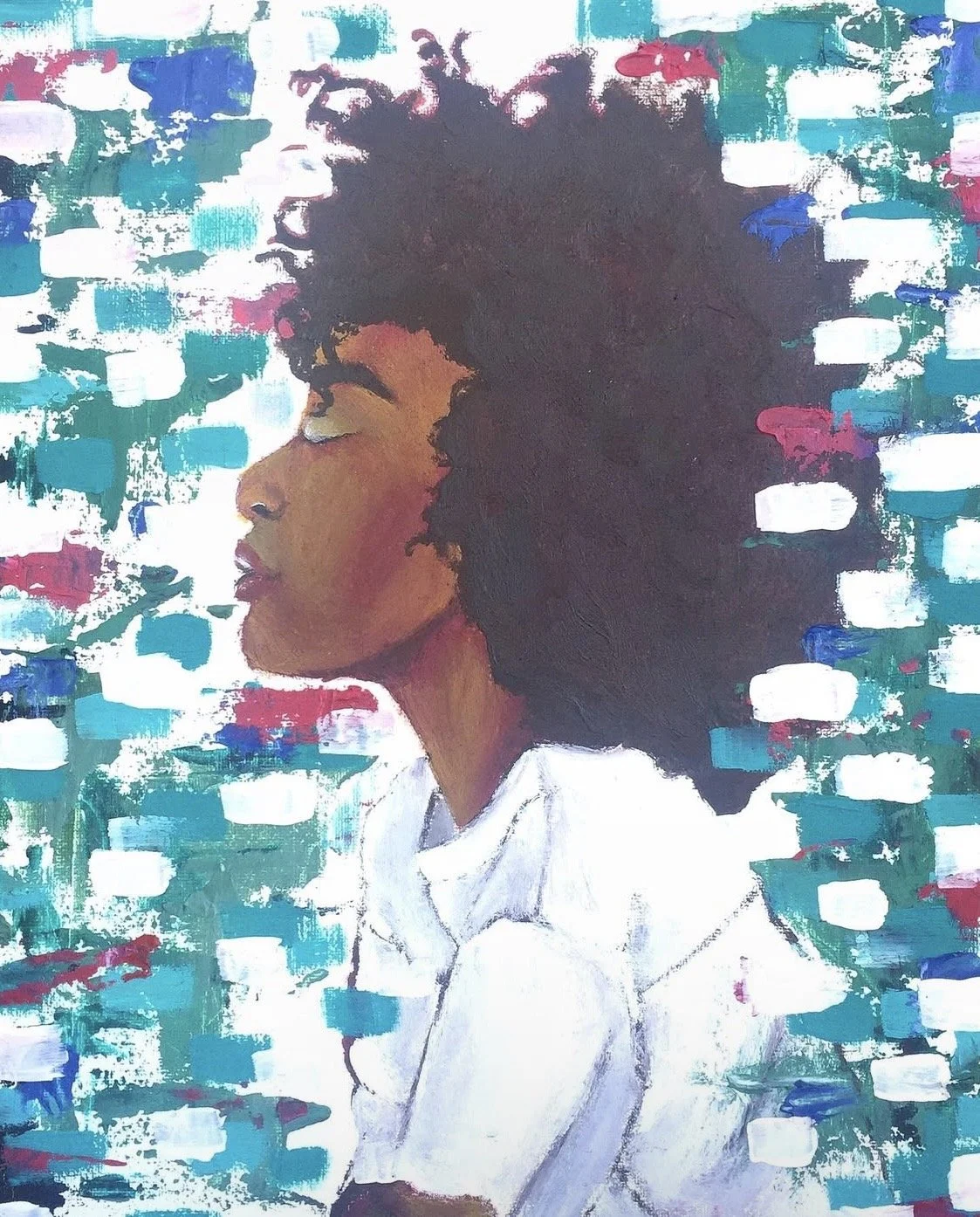
FREE
Oil and Acrylic Painting on Canvas, 11 x 14
This painting was my second attempt at using oils, but I also wanted to use a hint of acrylic paint for the background as well to try mixed media methods. As a young adult, I finally felt free during this period of my life, so I wanted to represent that through the women’s facial expression, and the abstract background. The painting looks almost as if the woman is transporting through time, and breaking barriers which is the exact look I was striving for.


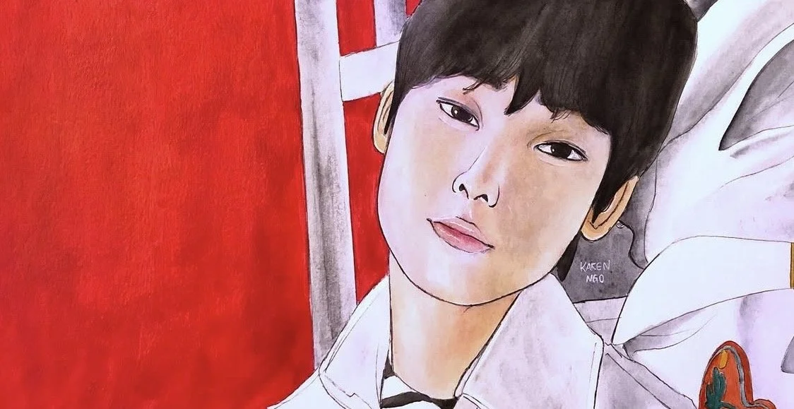
LET ME IN PT. 1
Acrylic Painting, 6 x 12
In high school, I was obsessed with the K-pop group Enhypen. At the time, they released a new music video called, Let Me In (20 CUBE), and one of the scenes from the music video caught my attention. The group used hyper realistic affects and pops of color for this video, and I thought it was very visually pleasing and unique so I decided to paint it. I made a few changes by making the boy stand out in white, and changed some colors, but overall, it is very similar.
CLEAN SLATE
Acrylic Painting on Canvas , 7 x 4.5
Around 19-20 years old, I lost motivation for art for a while, and I was also going through a break-up which made me even more unmotivated to create. After this phase, I was invited to a painting event by the same person I was in a break-up with, and this is what I painted at the event. When I started to paint, I felt a spark within me because I was reminded that I still have the gift of painting, and this inspired me to start again.

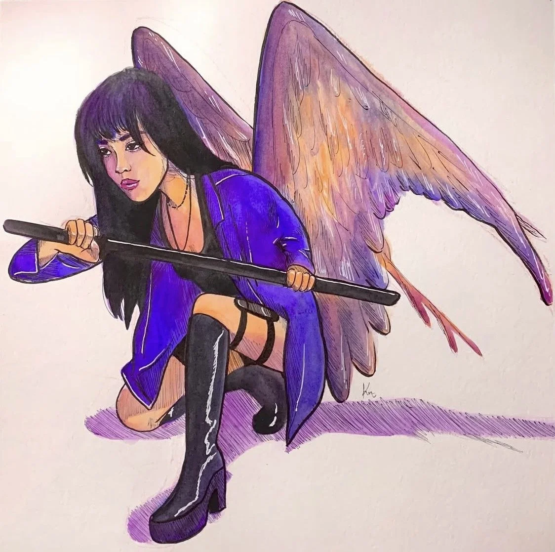
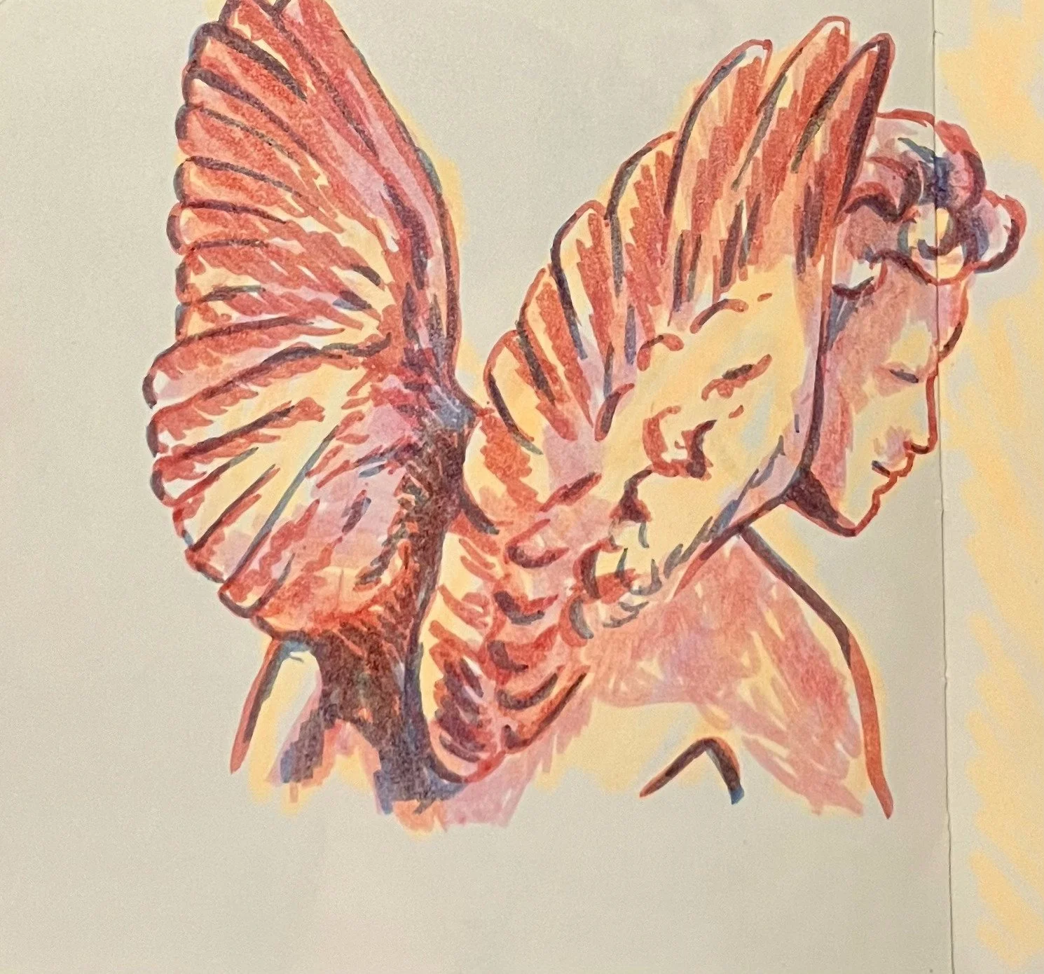
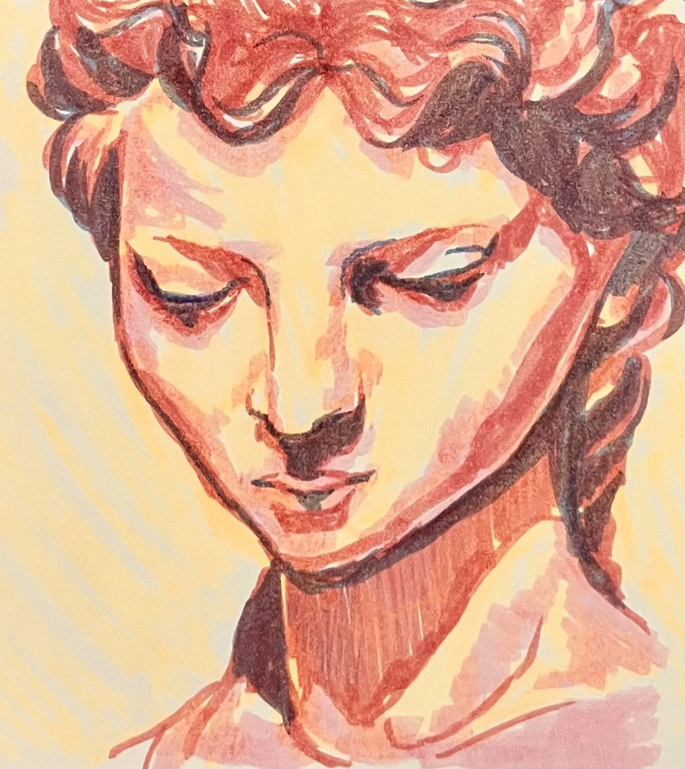
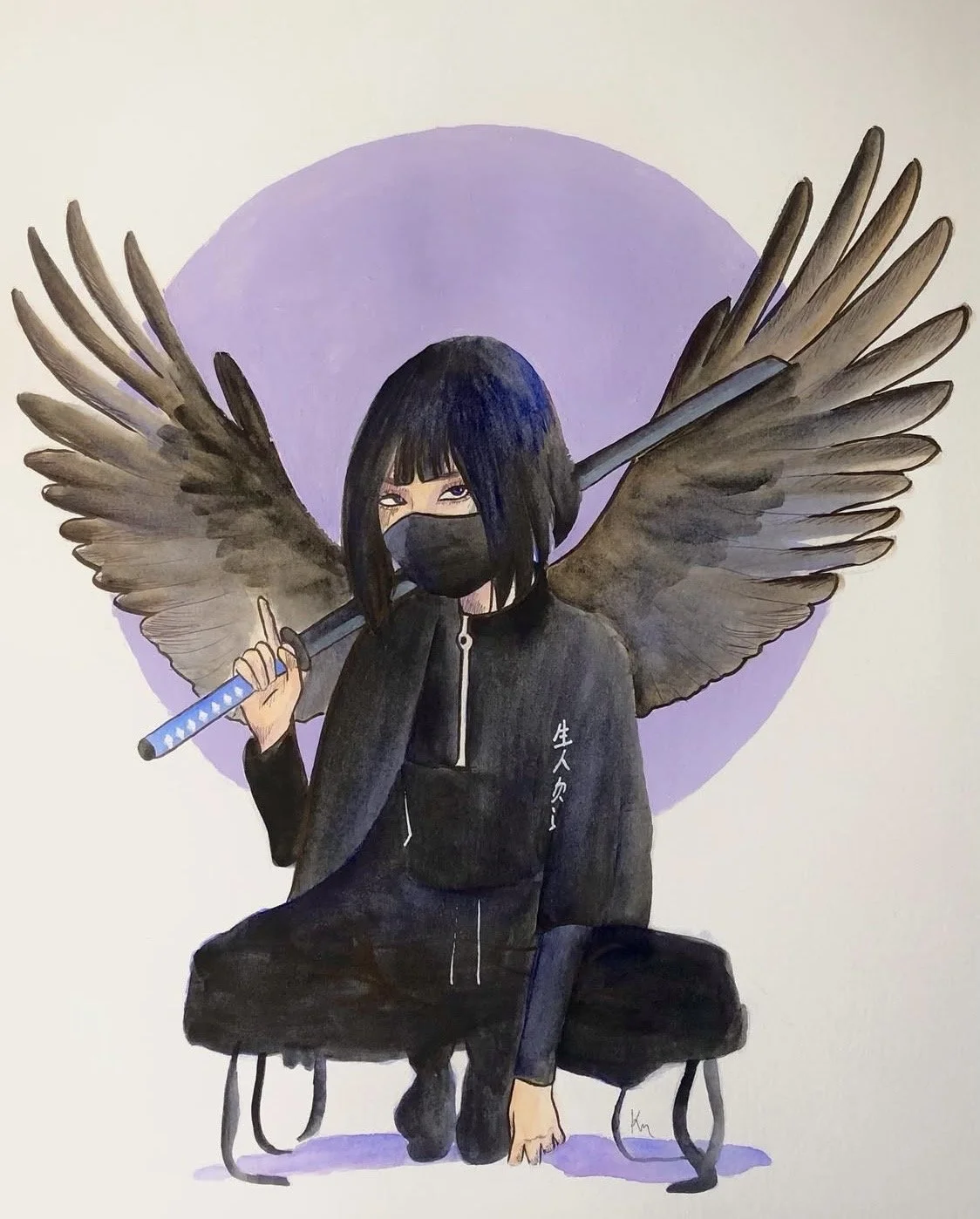
WARRIOR
Watercolour Painting, 12 x 12
At this point of my art career, I was in my gap year after high school, and I was deeply inspired, and used watercolor paints more than I ever have here. I wanted to paint something that would represent my persistence and determination to keep moving forward, and pursue art as my career. The sword is a symbol to represent how I am fighting my way through each obstacle, and the wings represent how I have finally reached the state of feeling free, and unstoppable. Wings are often associated with feelings of freedom and upliftment, so I wanted to reflect that in that way, and also using many vivid colors using pinks, purples, and complimentary hues such as yellows and oranges.
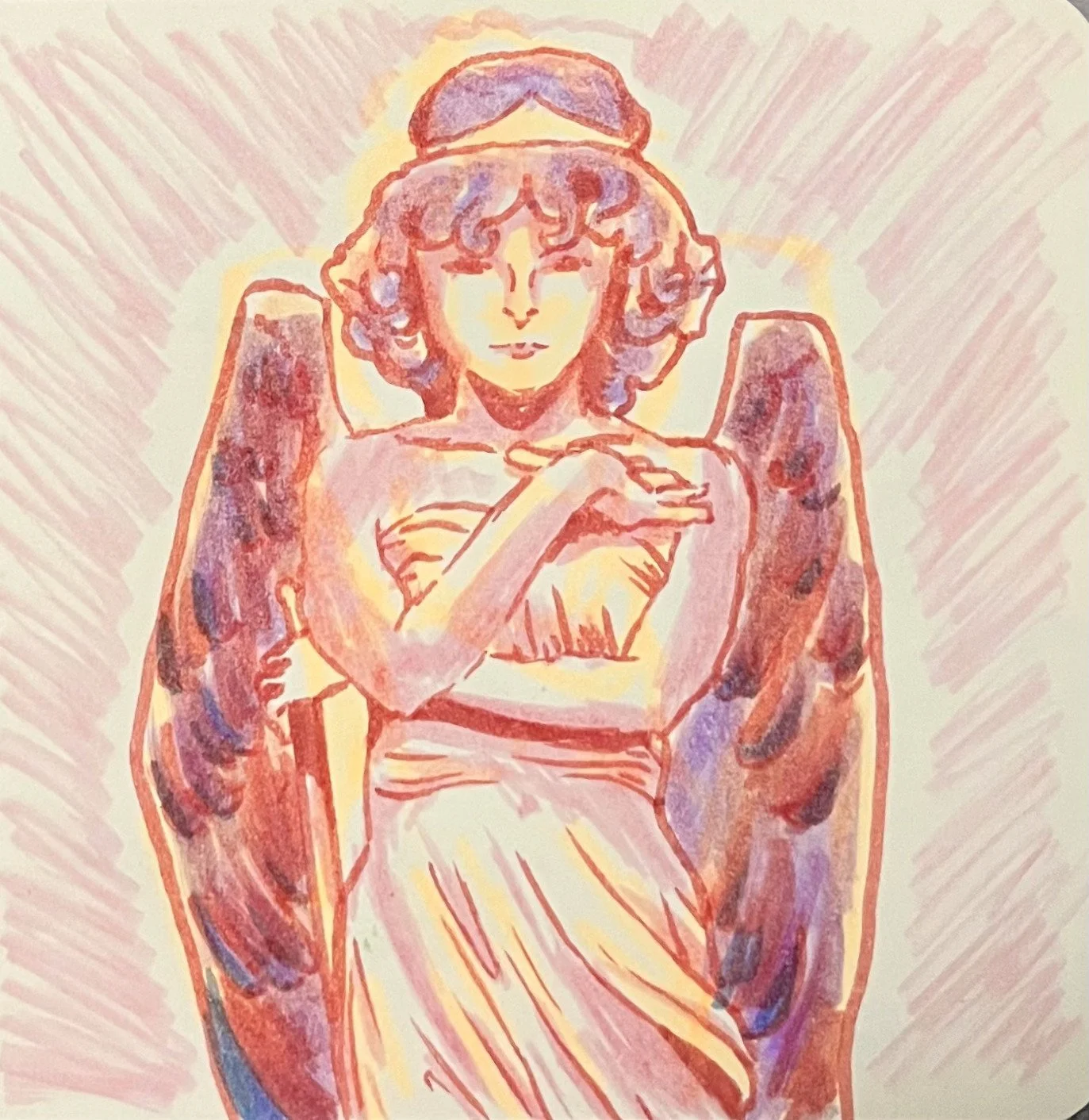
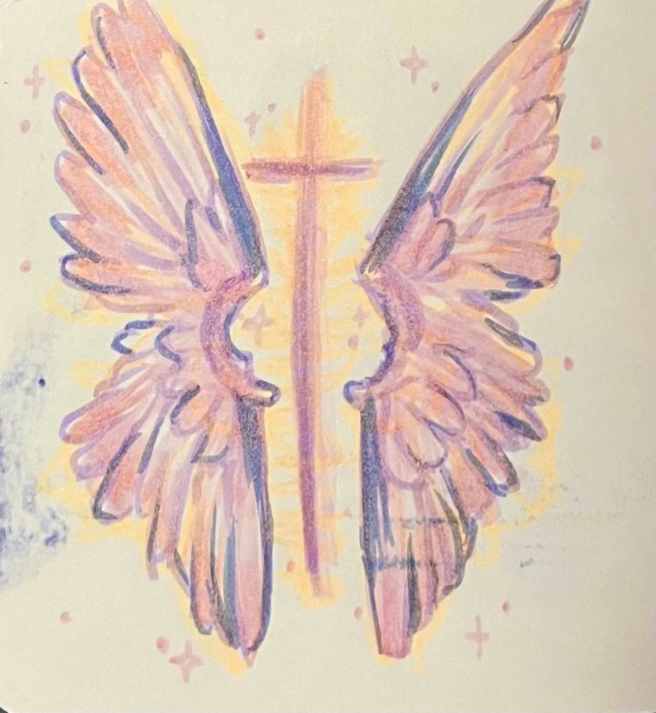
SOLDIER
Watercolour and Acrylic Painting, 18 x 12
In addition to the painting above, which was painted around the same time as this one, I wanted to convey similar meanings and feelings. With this painting, I also wanted to show the freedom and determination I was feeling, but I also wanted to try a new composition. I noticed that many artists I looked up to included subjects in the foreground with different shapes in the background, and I wanted to attempt that here. I chose a simple pose that I thought looked visually pleasing, and repainted that and added a circular shape in the background to match the rest of the shades of the subject. I, once again, added wings to the subject to represent freedom. Funny enough, I was obsessed with drawing and painting wings back then, and to this day, I still am as well.

MOODY
Watercolour and Acrylic Painting, 9 x 12
In addition to the painting above, which was painted around the same time as this one, I wanted to convey similar meanings and feelings. With this painting, I also wanted to show the freedom and determination I was feeling, but I also wanted to try a new composition. I noticed that many artists I looked up to included subjects in the foreground with different shapes in the background, and I wanted to attempt that here. I chose a simple pose that I thought looked visually pleasing, and repainted that and added a circular shape in the background to match the rest of the shades of the subject. I, once again, added wings to the subject to represent freedom. Funny enough, I was obsessed with drawing and painting wings back then, and to this day, I still am as well.
INCOMPLETE
Watercolour and Acrylic Painting, 18 x 12
As mentioned earlier, I had a phase where I could not get myself to create art because I was incredibly depressed and demotivated, which was a more recent time in my life (1 year ago), but this was 2-3 years ago. I went through several periods where I was motived, then demotivated, and then that would be a vicious cycle that would not end. This was one of the paintings I created during the periods of when I was motivated, and the unfinished look of the background represents how I felt like I was battling a cycle that I could not overcome. I felt incomplete so because of that I made this painting look incomplete as well. I also wanted to experiment with a different style since the hair includes more geometric shapes, and the linework includes harsher strokes as well.

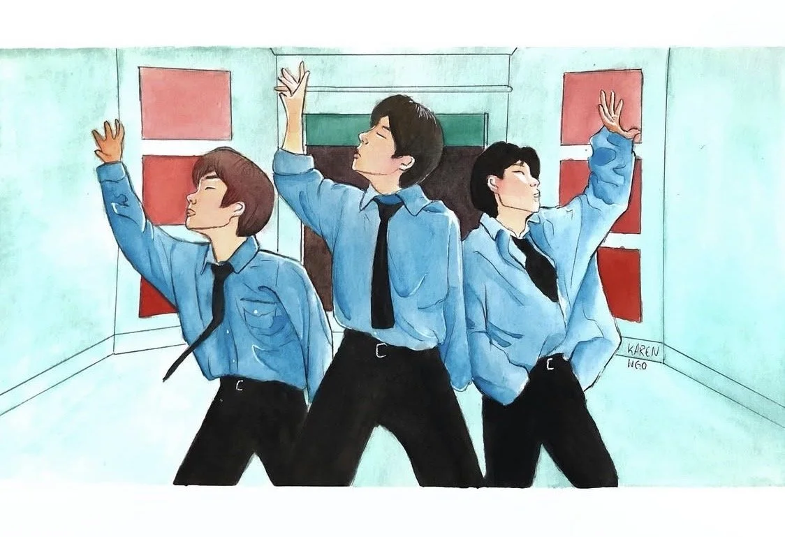
LET ME IN PT. 2
Watercolour and Acrylic Paintings
As previously stated, I was a K-Pop addict in high school, and one of the groups I particularly looked up to was Enhypen. These paintings were inspired by the same music video that inspired my "Let Me In Pt.1” painting above. These were my favorite screen captures from the music video that I simply wanted to repaint in my own style.

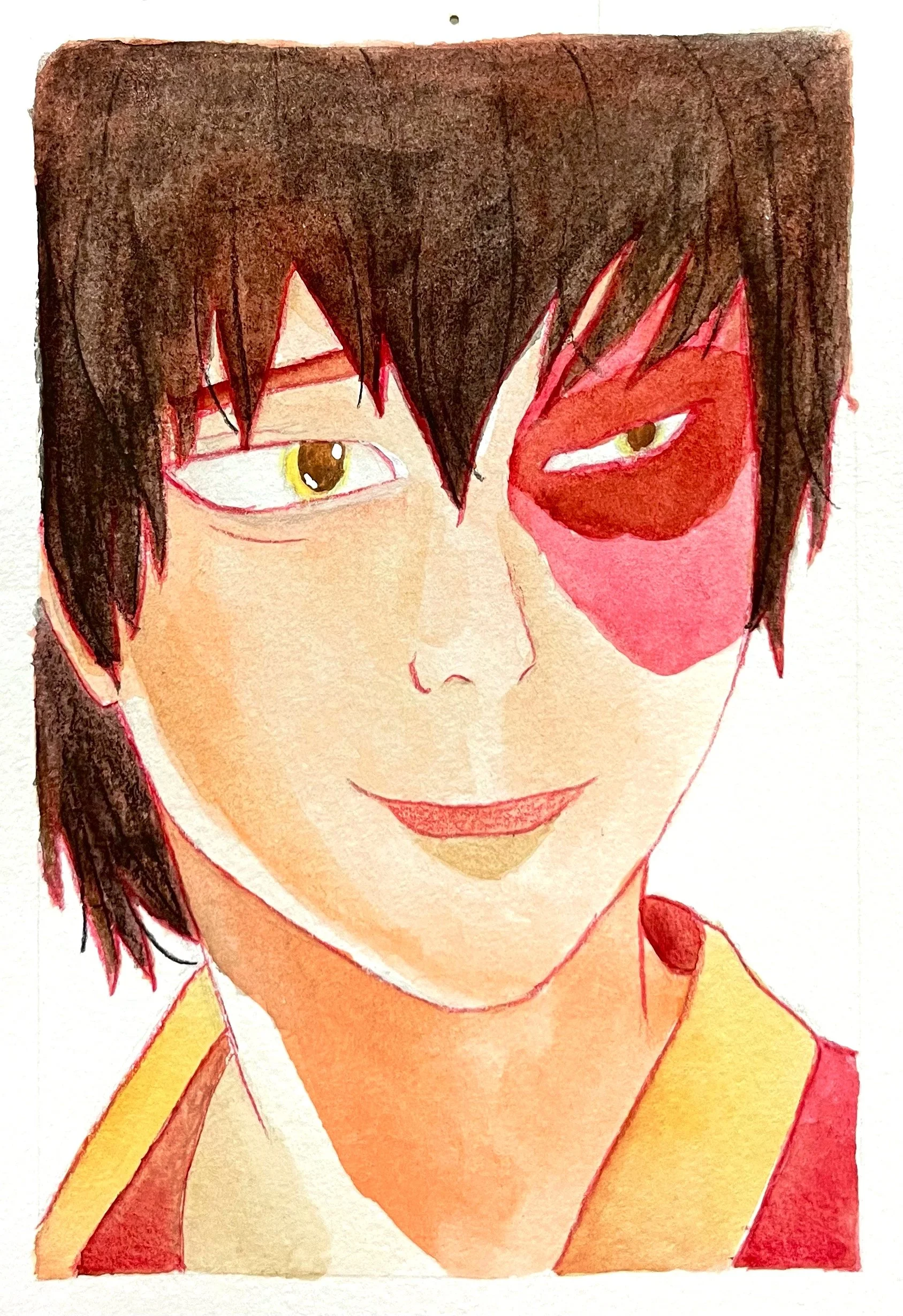
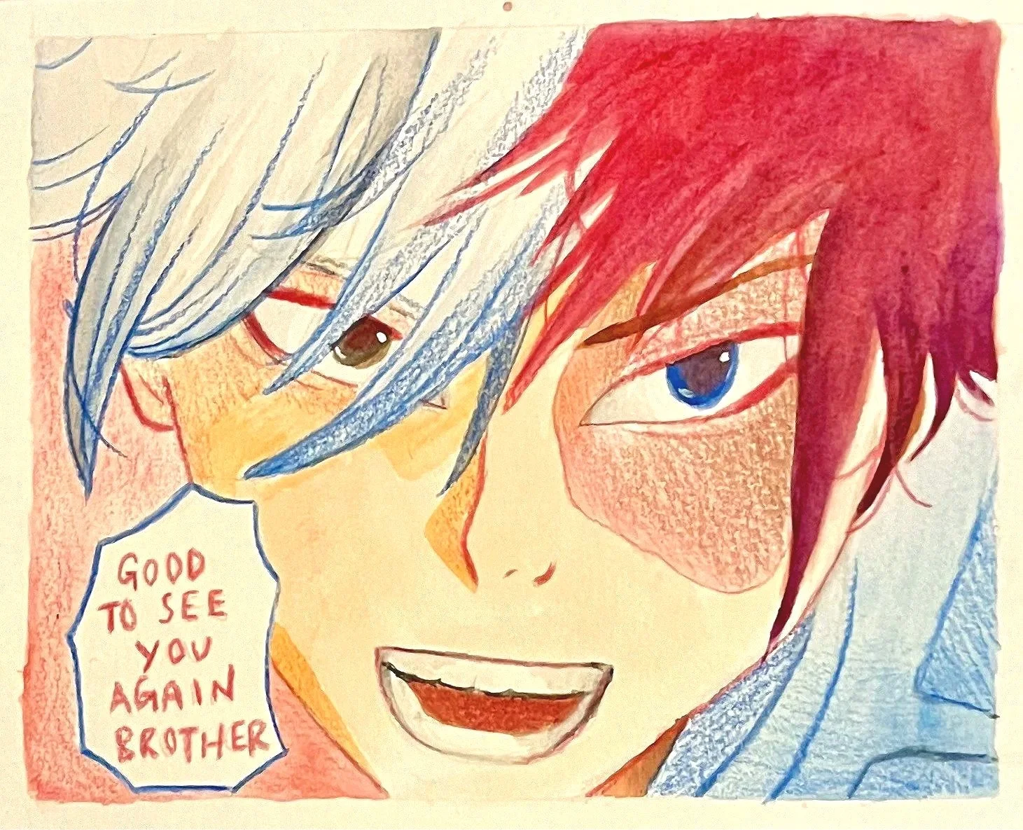
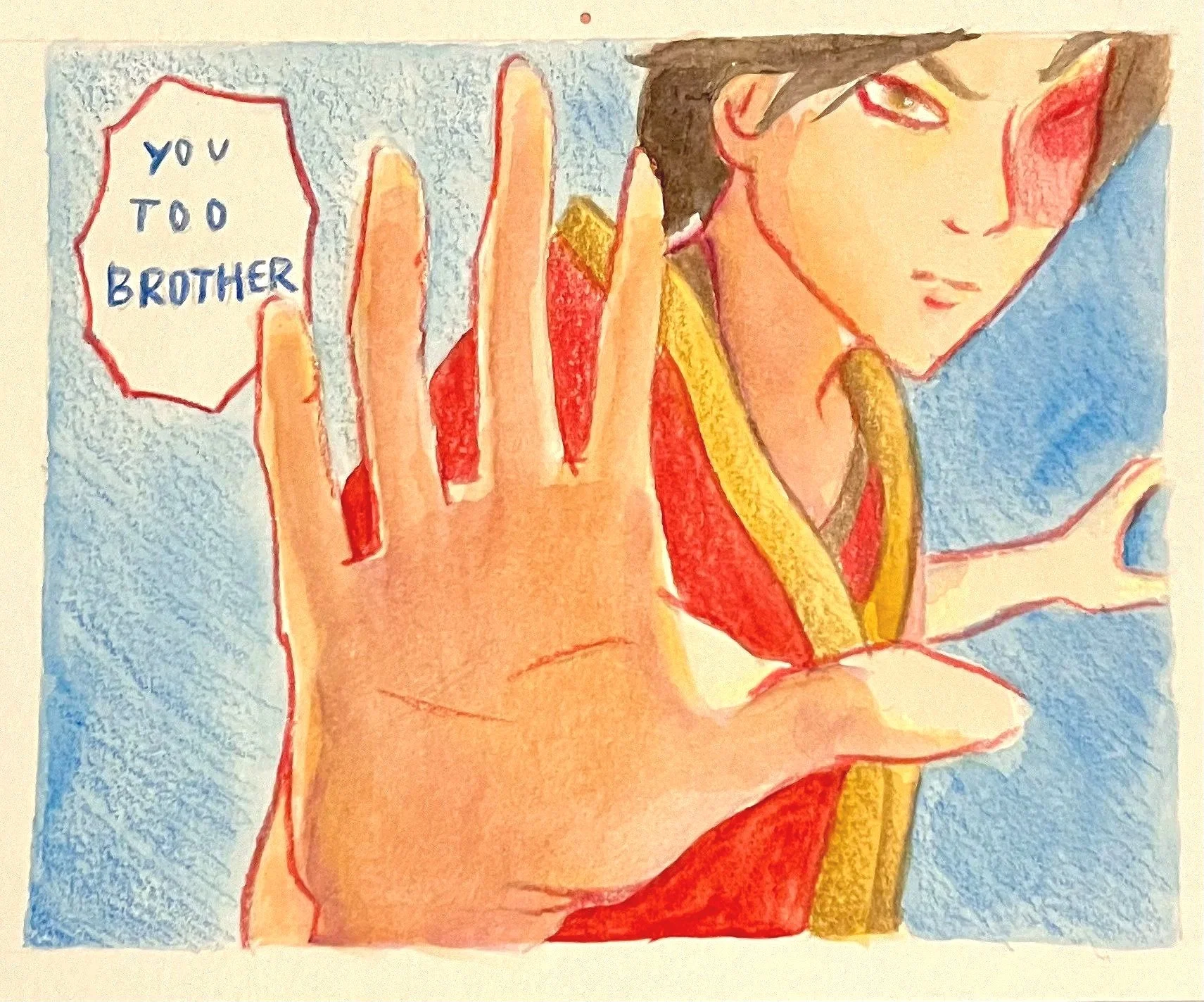
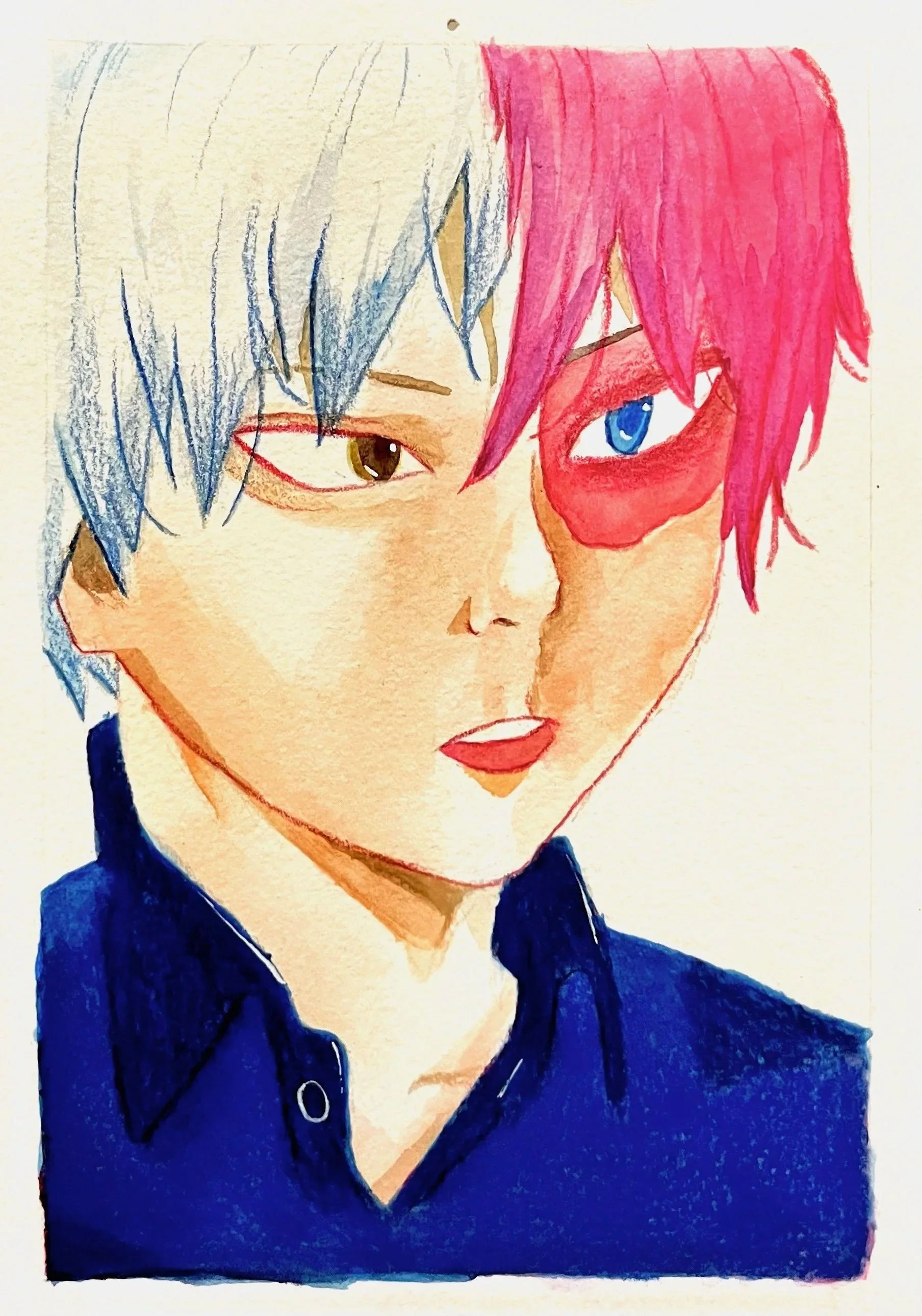
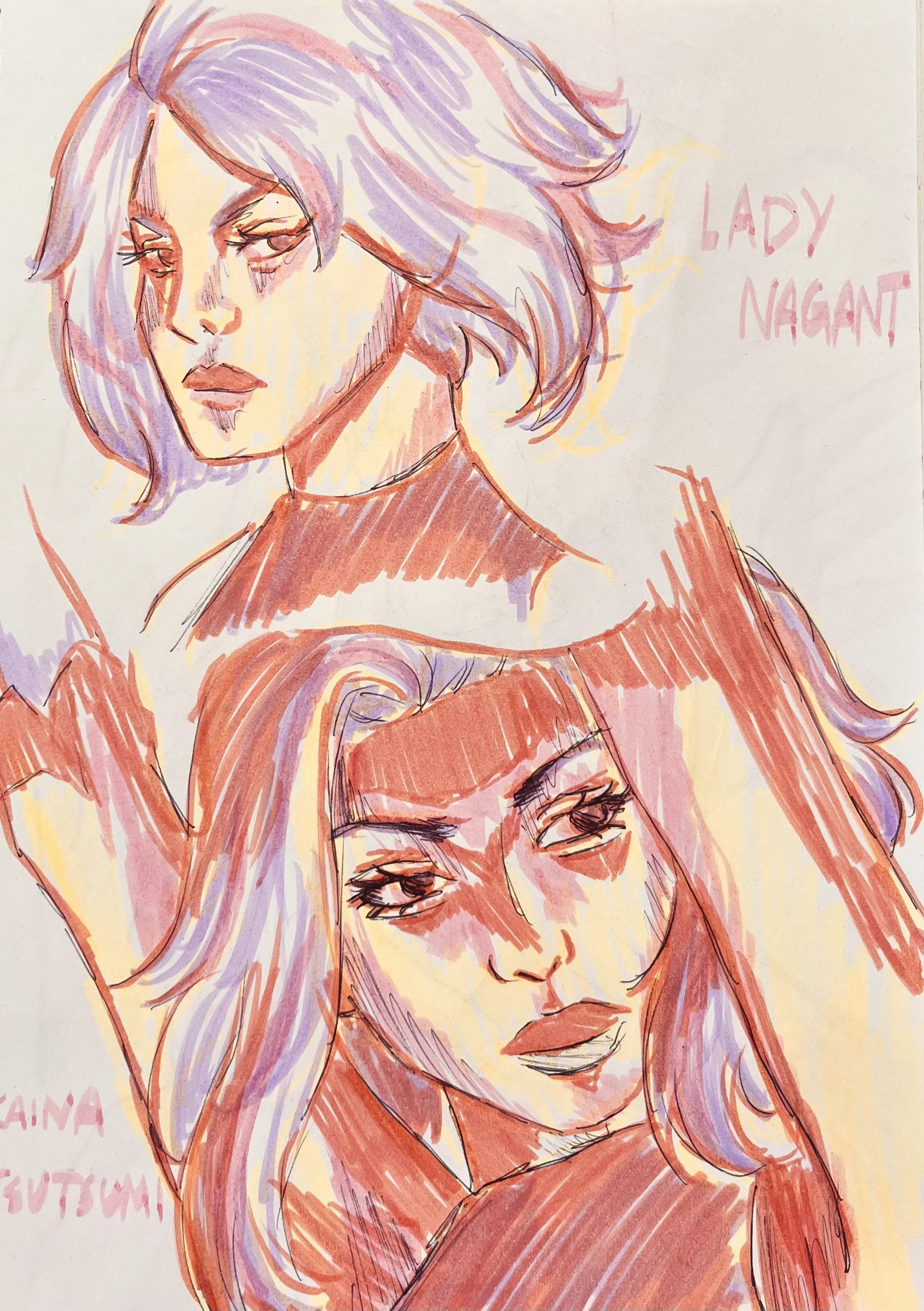
BROMANCE
Watercolour Paintings
In my first or second year of attending university, I took a Marketing class. My professor was teaching the class about how “bromances” between 2 or more men were a popular marketing tactic that companies and celebrities use to advertise their products or content. My professor proposed an assignment of which we were to choose 2 real celebrities or fictional characters which could be used to create a Marketing campaign. I chose Zuko from the cartoon Avatar: The Last Airbender and Shoto Todoroki from the anime My Hero Academia because they are both similar in appearance and back stories. I thought it would be an interesting to paint each character and have both of them interacting with each other in each painting, along with a portrait of each of them.

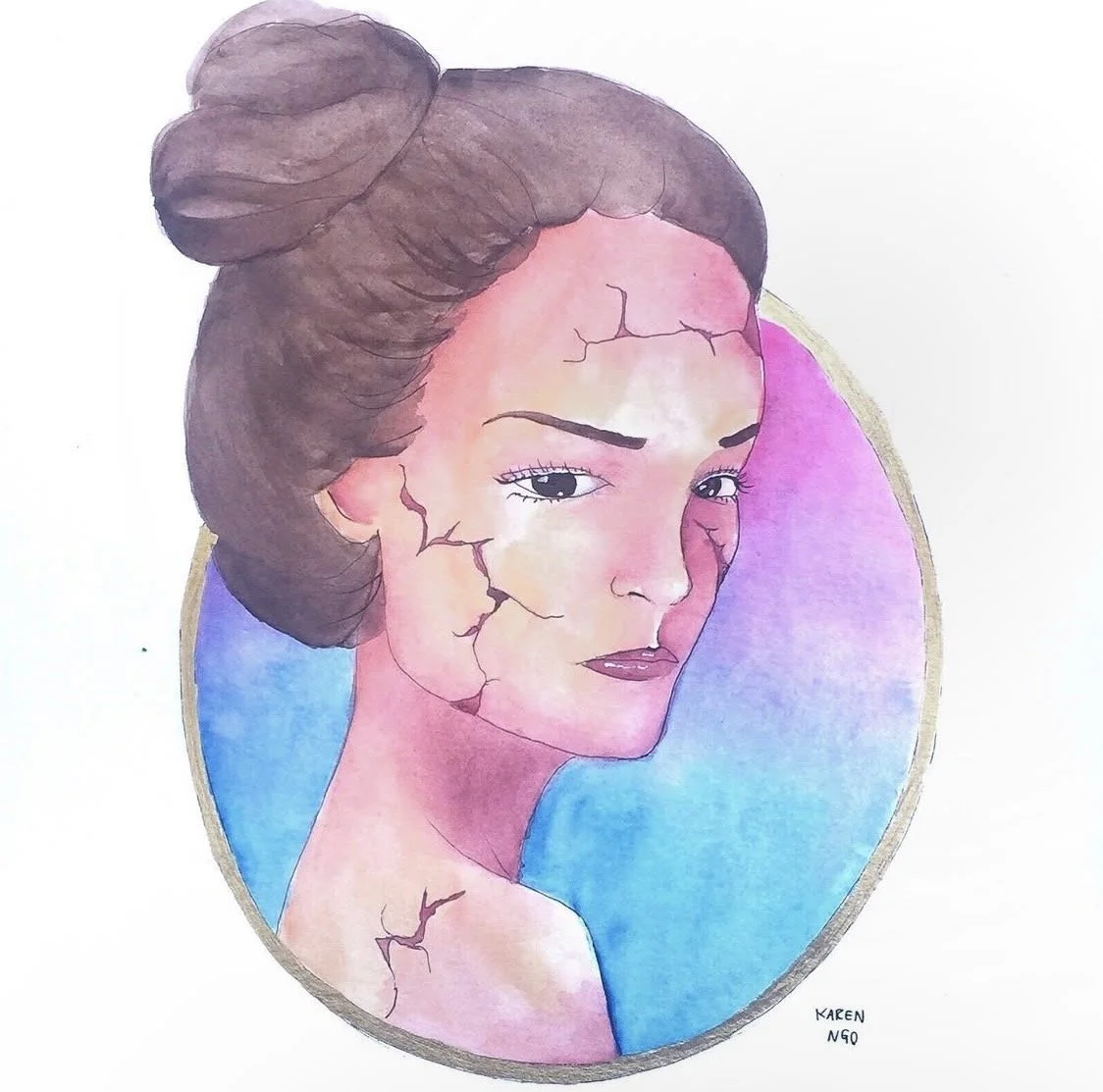
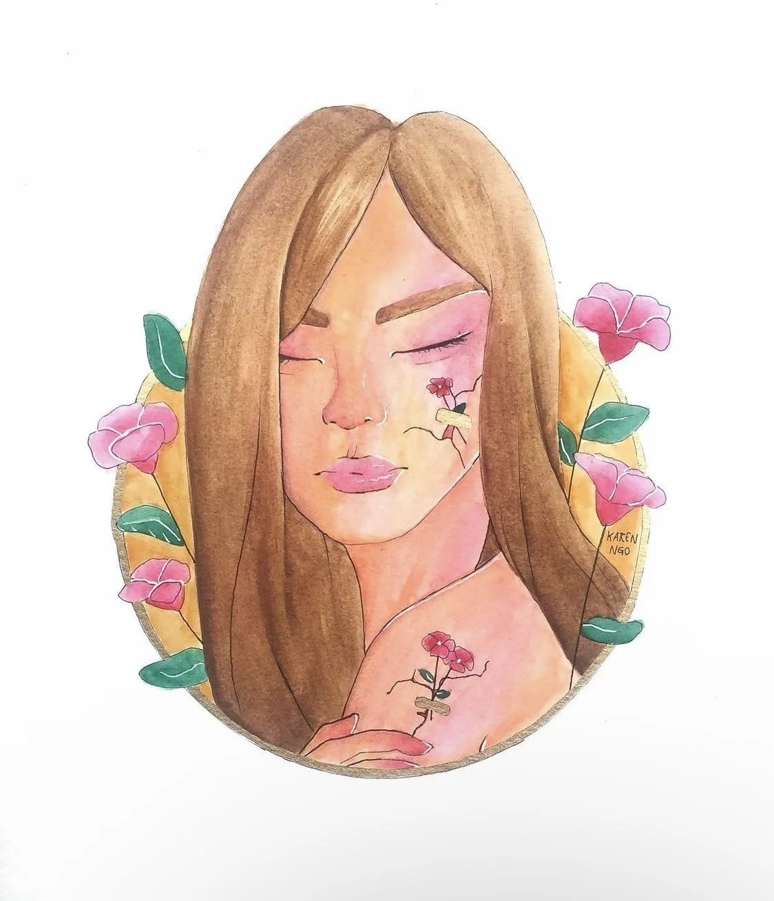
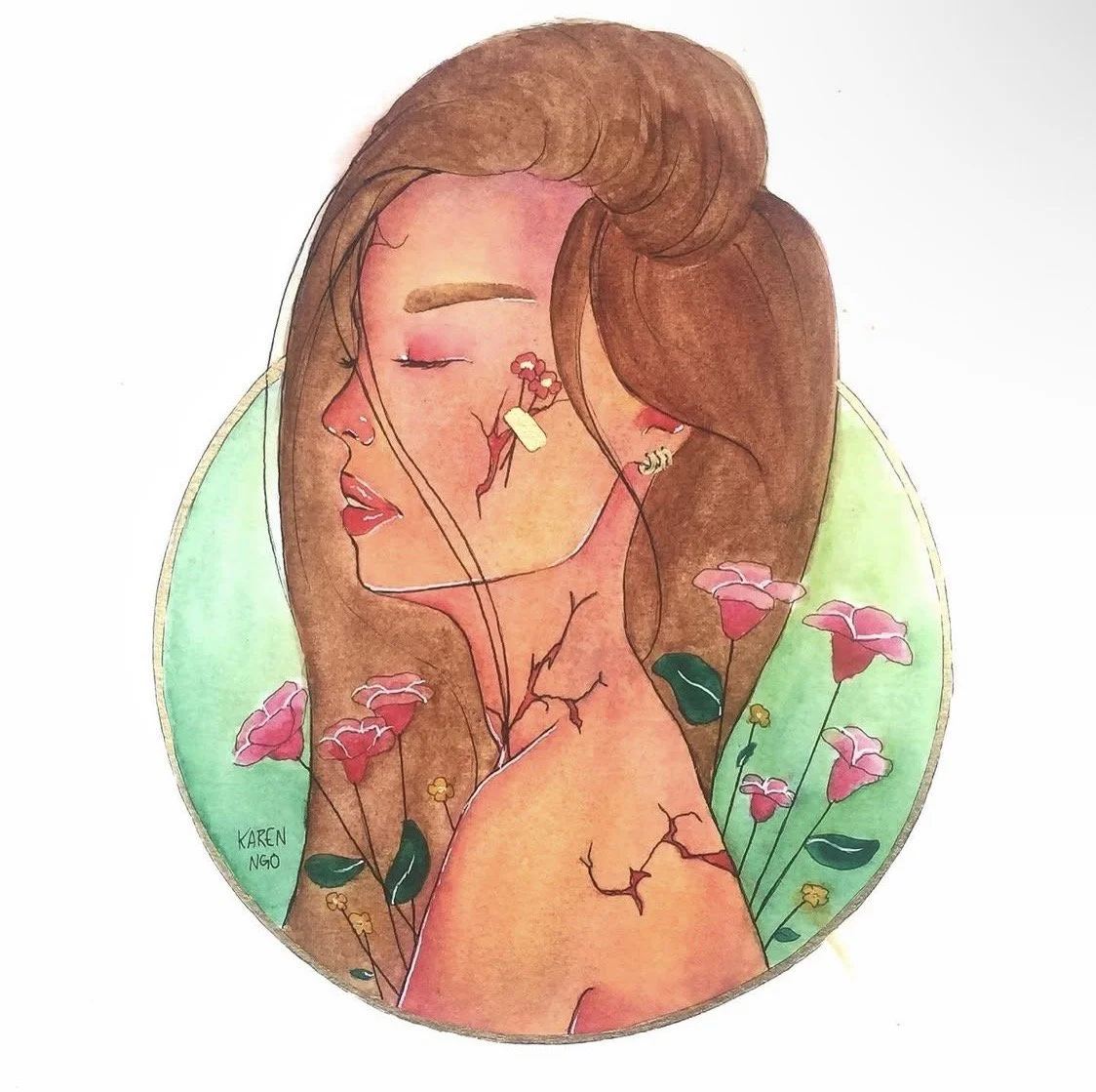
BLOSSOM
Watercolour Paintings, 12 x 12
After surviving my middle school years, (which were some of the worst years of my life), I was finally starting to enjoy life again, and I also saw my art career blossoming since I was discovering my art style, and things I enjoyed painting. I wanted my artwork to reflect the pain I was feeling, but as well as the growth and healing I was feeling in that period of time which is shown in these paintings, starting from left to right. The very left painting describes the brokenness I felt in middle school as represented with the cracks on the subject, and the serious facial expression. The painting in the middle describes the end of the chapter and the start of a new one which brought revival and healing, as represented with the flowers that are blossoming on top of the cracks. However, I was still recovering from that period which is why there are still cracks on the skin without flowers. The painting on the very right represents full acceptance, healing, and forwardness.
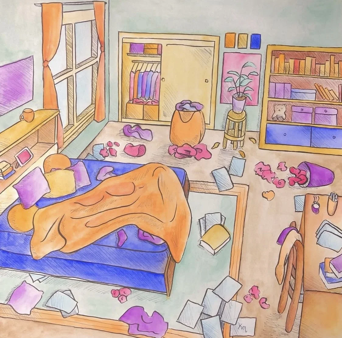
MESSY
Watercolour Painting, 12 x 12
To improve on my skills, and broaden my horizons, I attempted a painting based on challenging my perspective techniques. Using the method often taught in High School Art classes, I chose a vanishing point, and drew lines that would connect to that vanishing point to ensure that every object in the room would align. I also limited my color scheme to 2-3 colors to challenge myself even further, and also to keep the color scheme consistent and simple.
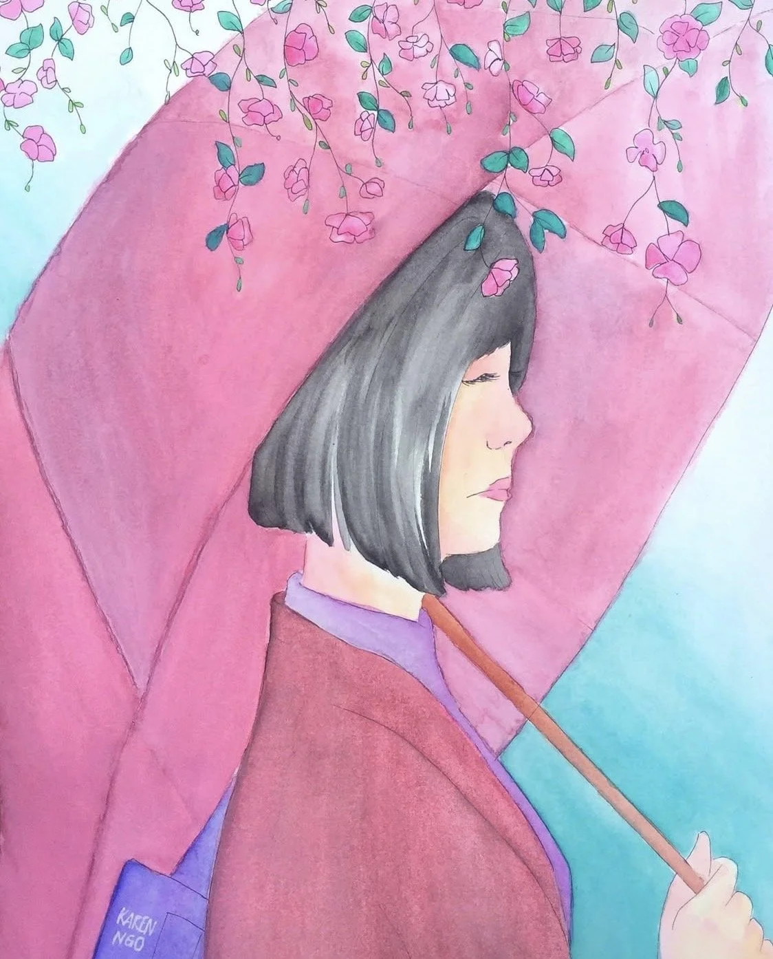
GARDEN OF WORDS
Watercolour Painting, 10 x 12
Like most of my paintings, which are inspired by pop culture, this painting was inspired by an anime movie I watched called, Garden of Words. I was absolutely in love with the animation, aesthetics, and the screen captures that I found of the film and decided to paint one of the scenes, and add my own spin to it by adding flowers to the top, and using colors that I like.
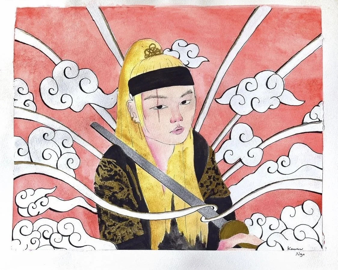
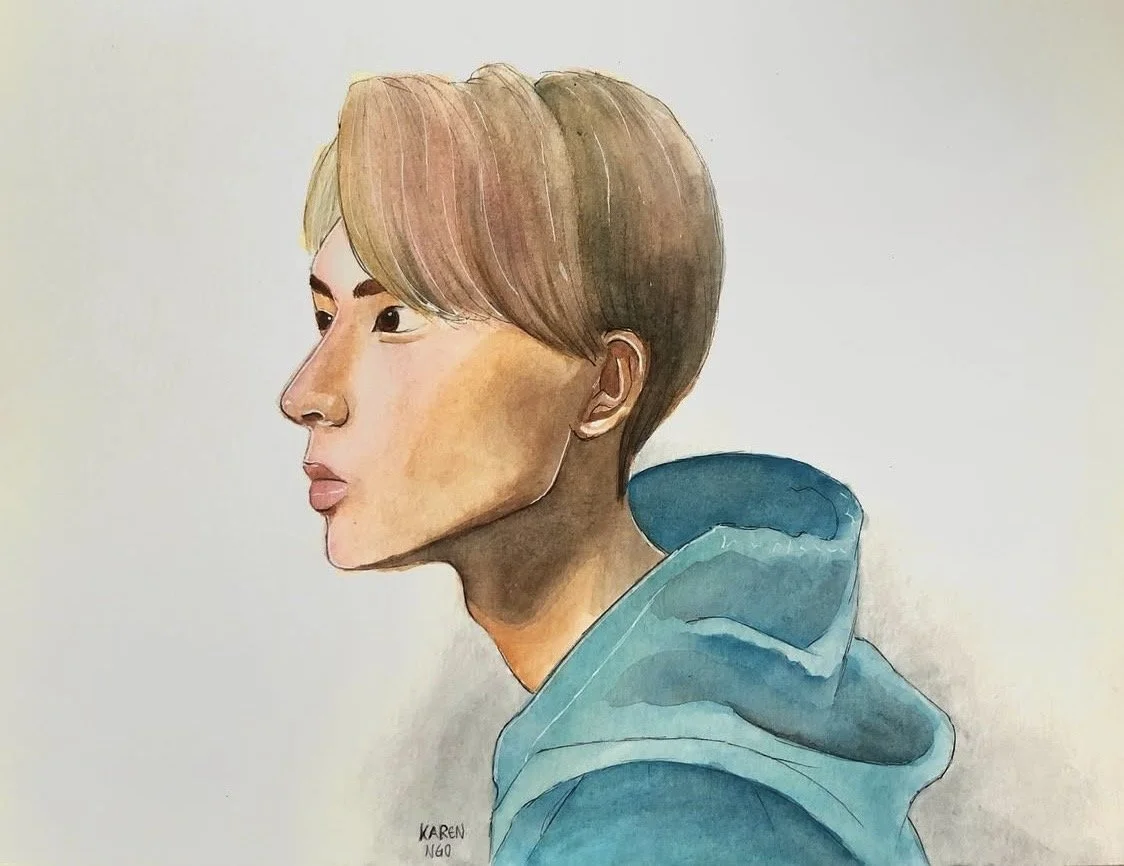
DAECHWITA
Watercolour Painting, 9 x 12
Continuing on with my K-Pop obsession in Middle School and High School, Suga of BTS released a music video called Daechwita, and just like the paintings I created for Enhypen’s music video, I really enjoyed the imagery that was used in Suga’s music video, so I decided to repaint one of the scenes and added my own spin to it by drawing traditional clouds in the background.

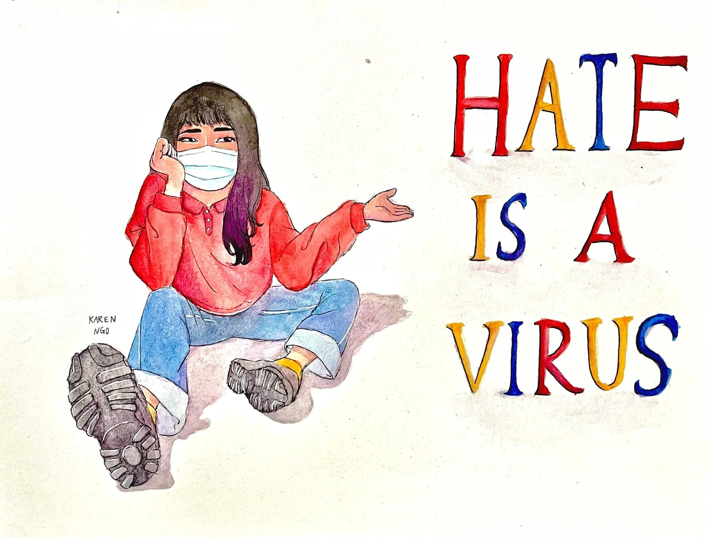
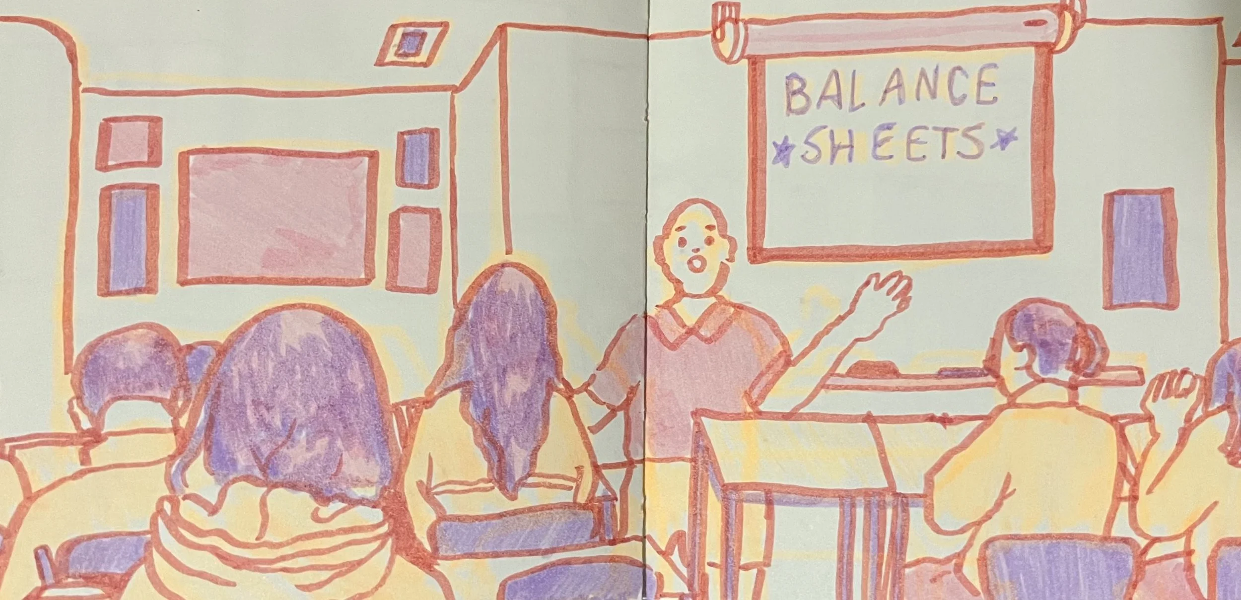
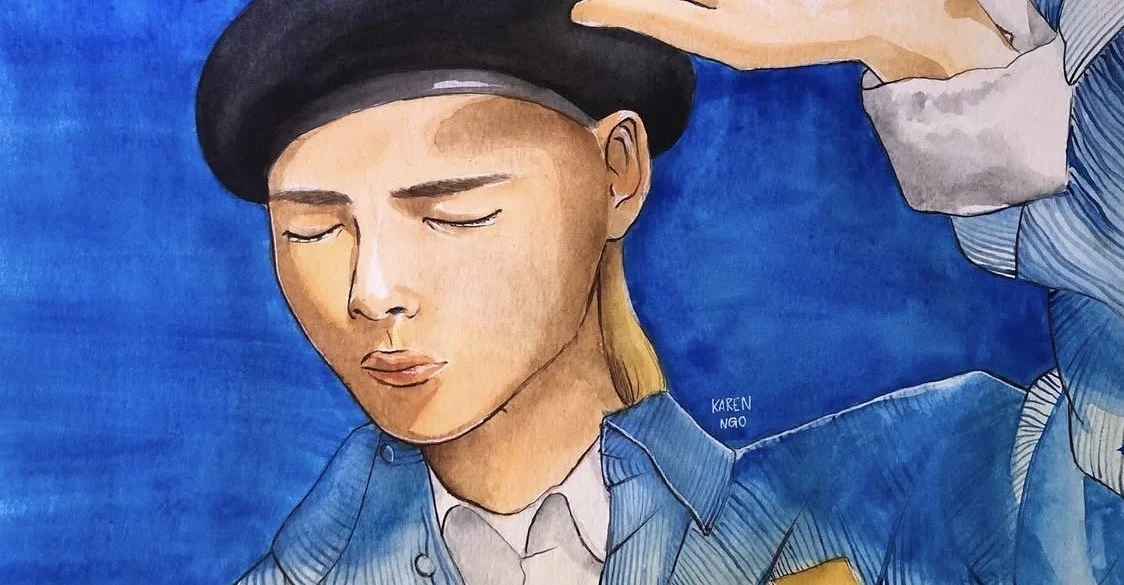
HATE IS A VIRUS
Watercolour Painting, 12 x 9
During the COVID-19 pandemic, I noticed that there was a lot of hate towards Asians, and I was seeing a lot of violence towards them in videos I watched online. I was heartbroken, and fearful because I come from a Chinese-Vietnamese background, and I was scared either my parents, siblings, or I would face this violence as well. Instead of giving into my fear, I decided to stand against this crowd of hate and decided to make art to speak on my feelings instead. I decided to paint myself gesturing to the words on the right to represent how I felt. I posted this on my Instagram account in hopes that I would inspire people, and spread a positive message.
DECKARD
Watercolour Painting, 9 x 12
I had a Nintendo 3DS as a child, and one of the apps on it allowed you to watch new cartoons. One of them was Bee and Puppycat, and the first episode was airing, so I gave it a watch. I ended up really loving it, but I couldn’t find any other episode until I got older, and discovered Bee and Puppycat again. I watched all of the episodes on YouTube, and it became one of my favourite cartoons to watch. To this day, I still find myself rewatching the series over and over again. One of my favourite characters was Deckard because he was so unique to me, and I thought he was very genuine. That’s why I decided to dedicate a painting specifically to him.
WHEEIN THE MOOD
Watercolour Painting, 18 x 12
Another K-Pop group that I loved back then was MAMAMOO. I was inspired by their AYA music video and their album’s photoshoot concepts. I wanted to dedicate a painting to my favorite member, Wheein, using that same photoshoot concept. She stood out to me in particular because I always thought she was so talented and super gorgeous! Her solo music matches my taste completely as well, so that is why I wanted to paint her. I did my best to capture her likeness in this painting. This one challenged me to use color combinations hat I don’t typically use for my drawings, and paintings, but it taught me a lot about how to use different hues and values to match the reference I was using.

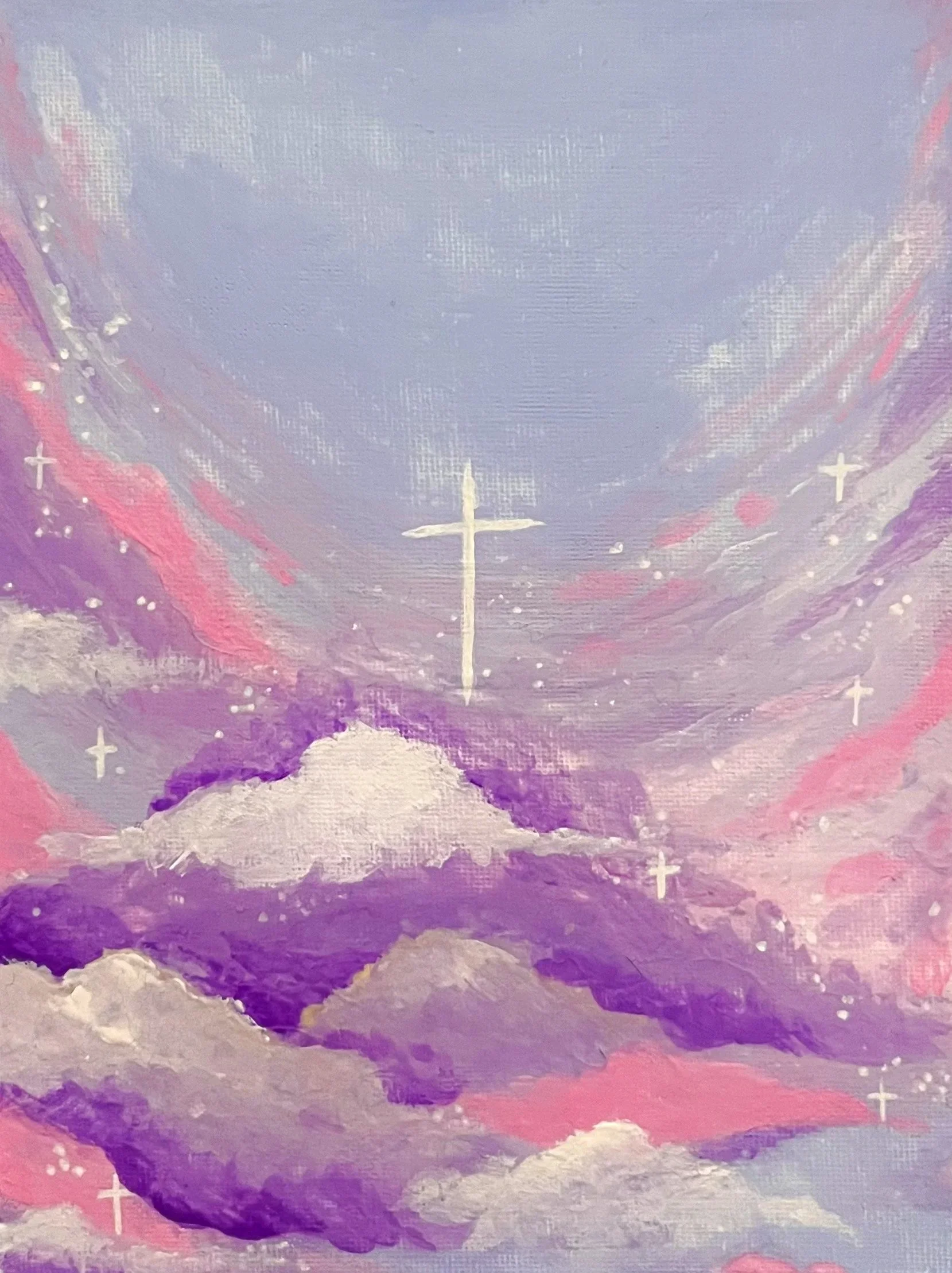
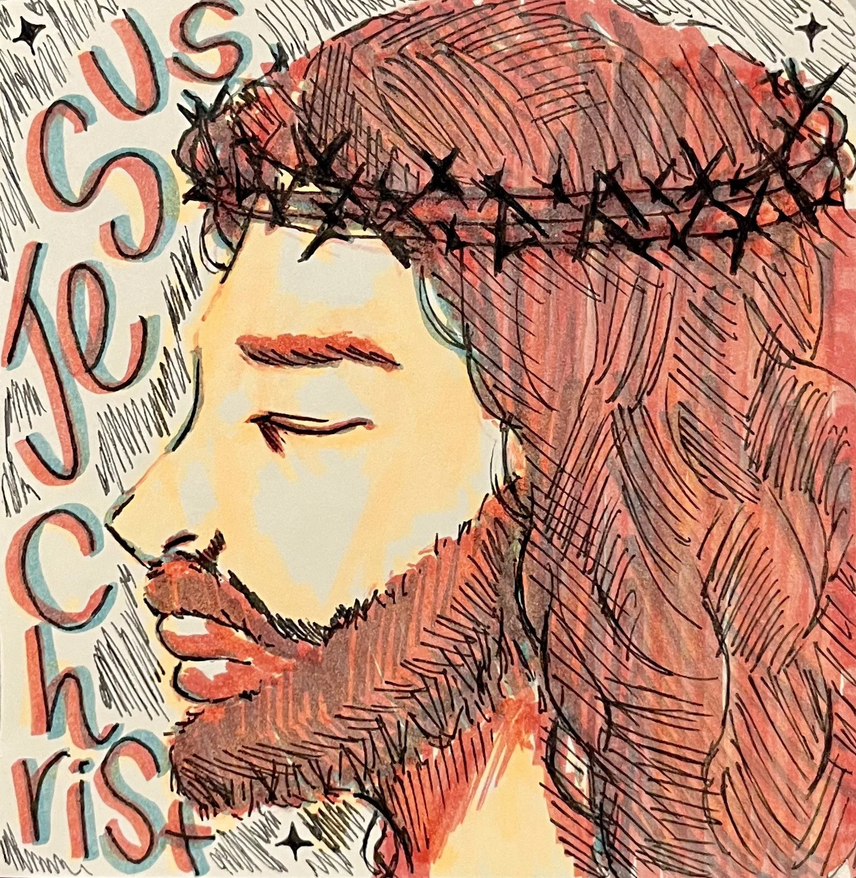
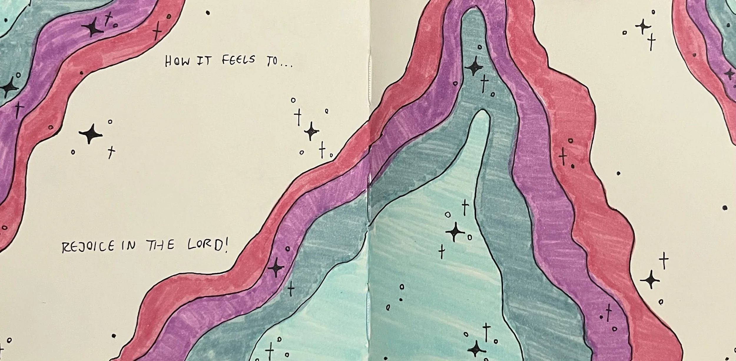
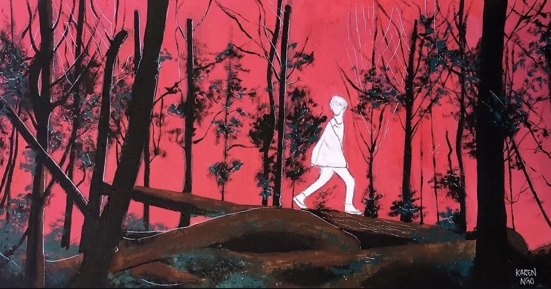
STAR IN THE SKY
Gouache Painting, 6 x 8
In 2024 I had, once again, lost motivation to create art because I was in a toxic relationship and that relationship unfortunately made me lose the desire to try in a lot of things. On top of that, I was also incredibly busy with classes and academic extra curriculars. I completely gave up on art and began to wonder if it was even for me anymore. I lost all confidence, and didn’t think I had a purpose anymore. Then over time, I found God. After believing in Jesus Christ, and that I was made on purpose, and for a purpose, I finally understood that my calling was art. I was not given these skills and talents for no reason, but rather, to use them to help and inspire people, and to give all the glory to God! This painting is a reflection of my love for Jesus, and this is also the first painting I made as a Christian. I used bright colors and sparkles to represent how God has changed my life, and made it more colorful. Likewise, the clouds represent how Jesus lives in heaven which takes place above in the clouds, which is also represented through the cross, which also happens to look like a big star.
“We saw his star when it rose and have come to worship him.” (Matthew 2:1-3 NIV)
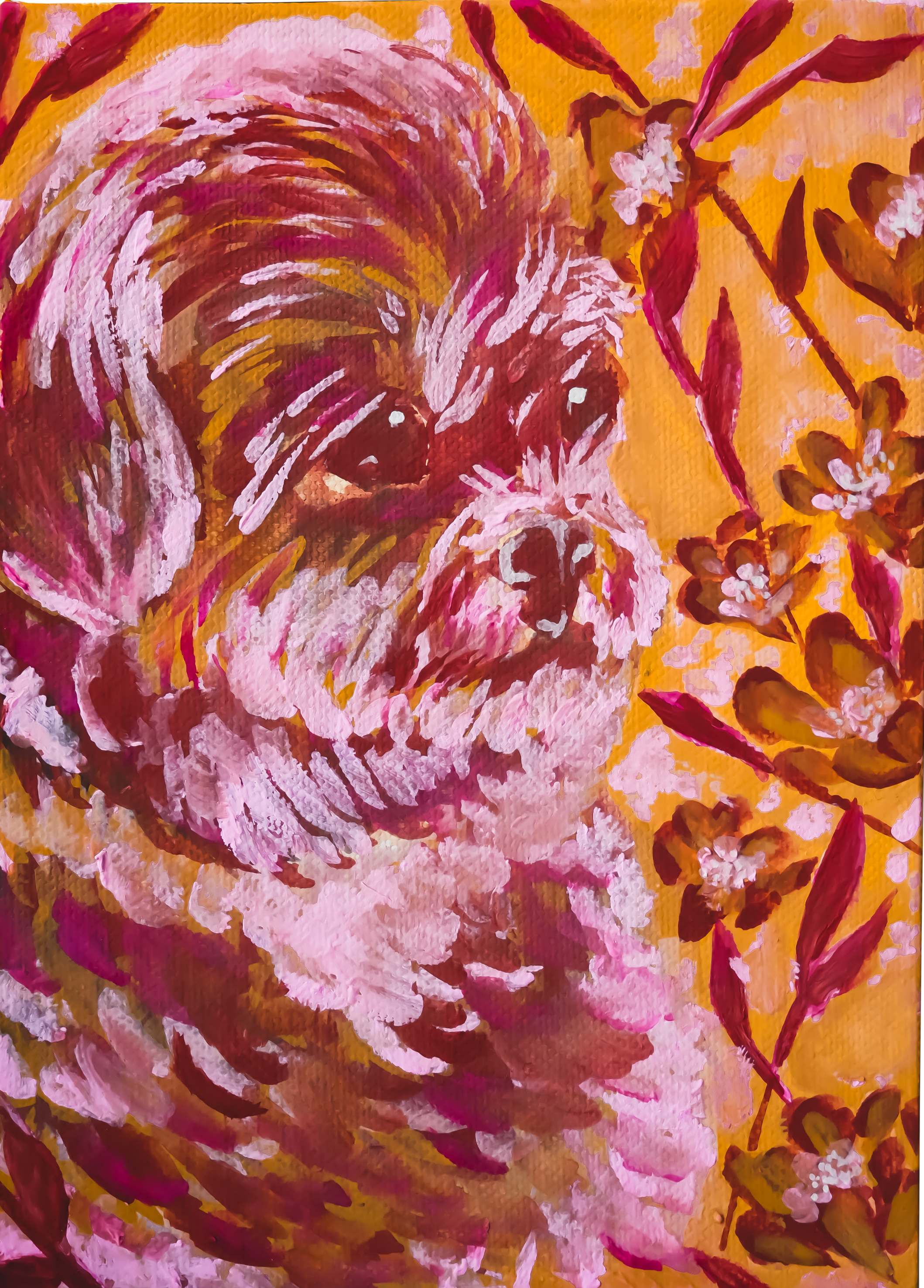
TIKA
Gouache Painting, 6 x 8
This painting was a gift to my current boyfriend for his 25th birthday. His dog had passed away in the previous year, so I decided to paint his dog, named Tika, to honor her, and give my boyfriend something to remember her by. I attempted to reflect her likeness in the painting, but I also wanted to capture her energetic spirit through bright colors. I also wanted to limit my color palette to challenge myself by using only warm colors, but shifting between warmer and cooler values to get a wider range of depth.
SPACE
Digital Painting, 9.447” x 8.5”
This digital painting was created on Procreate, and it was one of my first attempts at a full painting using only digital art. I have always been a traditional artist, and it is my preferred medium for painting, and drawing, but I wanted to try something new. That’s why I gave myself some space to learn digital art in hopes to gather new skills, that I could potentially transfer into my traditional art as well. I found digital art rather challenging because it has a different structure in comparison to painting with an actual brush, but it is still fun because it comes with a set of tools that can help you paint more efficiently.
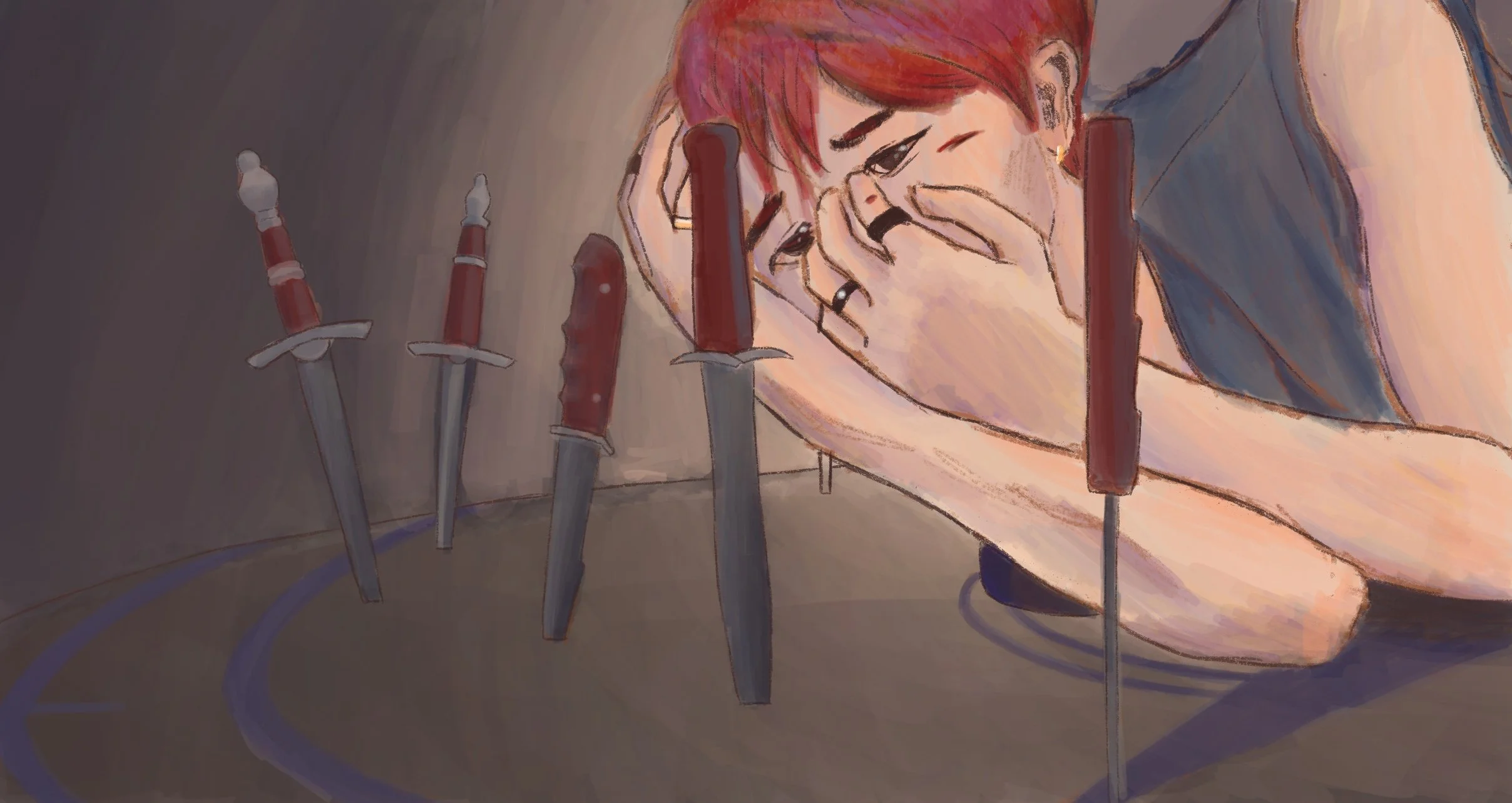
KNIVES
Digital Painting, 2416 x 1283 px
My fascination with K-Pop music videos never ends because this is, yet another, painting that was inspired by SEVENTEEN’s “HOT” music video. Within the first few scenes of the video, I was amazed at the imagery that was used with the member Minghao, and how he was surrounded by knives. I used that as an opportunity to practice facial expressions, and to play around with darker colors that I don’t typically use. It was difficult to show his facial expression since most of his face is covered by his hands, but I used that to my advantage to show how closed up he is, and I focused on the eyes and the eyebrows to convey emotions of fear, insecurity, and anxiety. The knives around him also add to that feeling because it creates danger, and captivity.
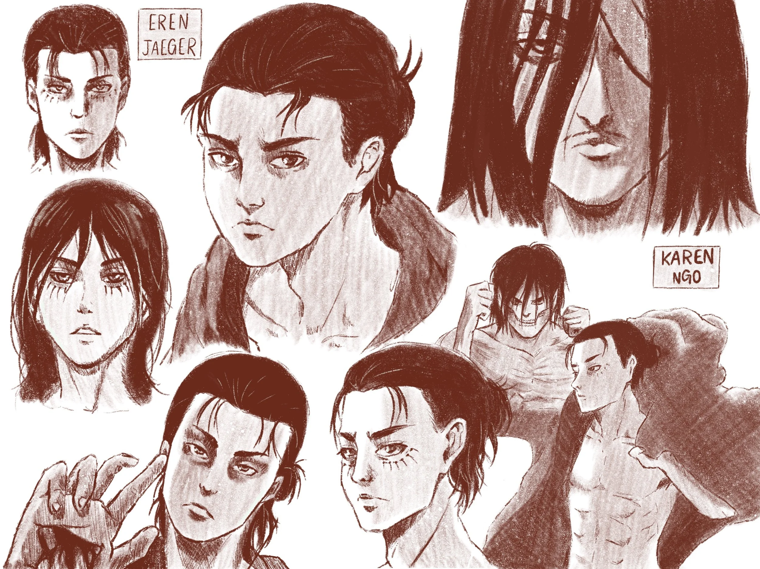
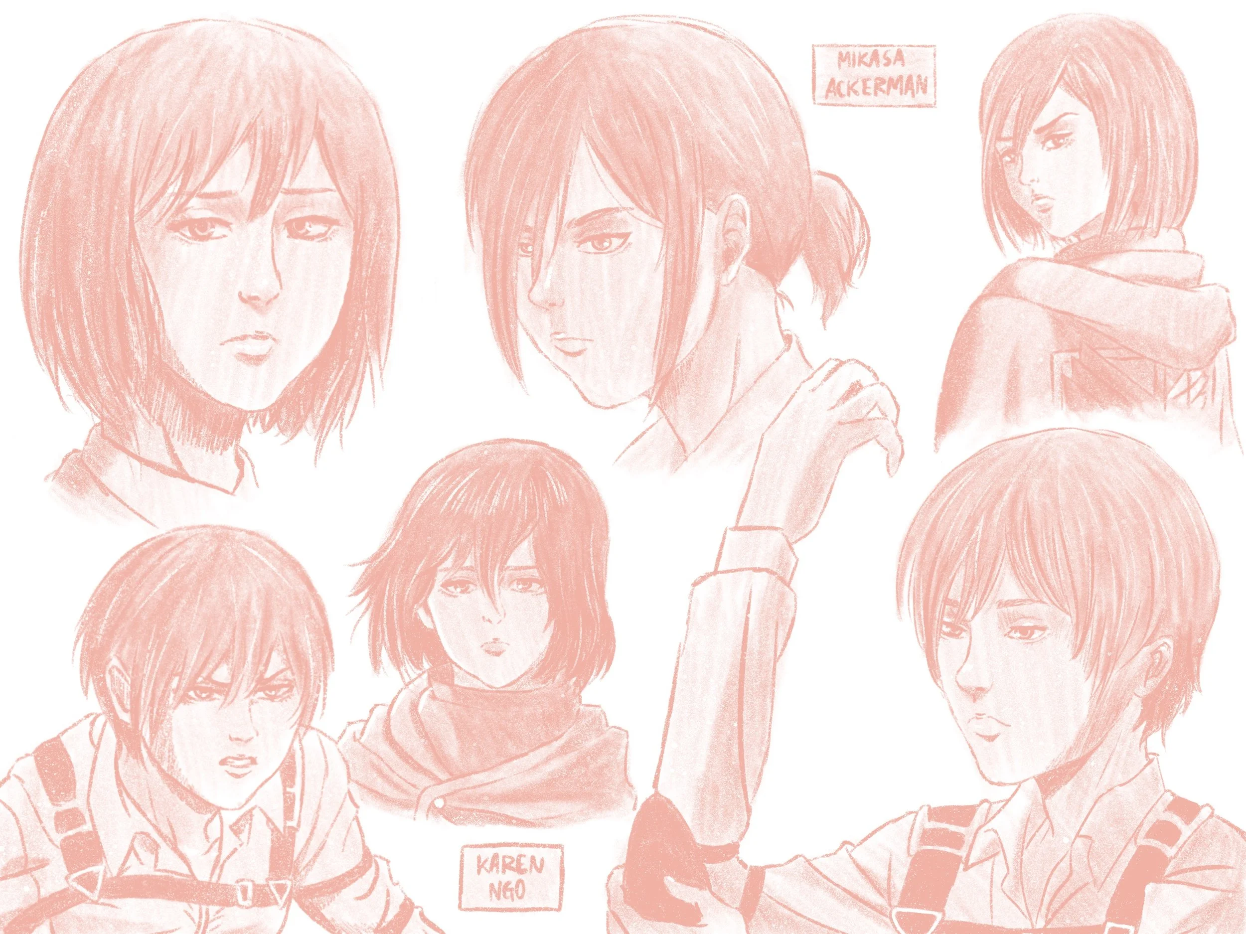
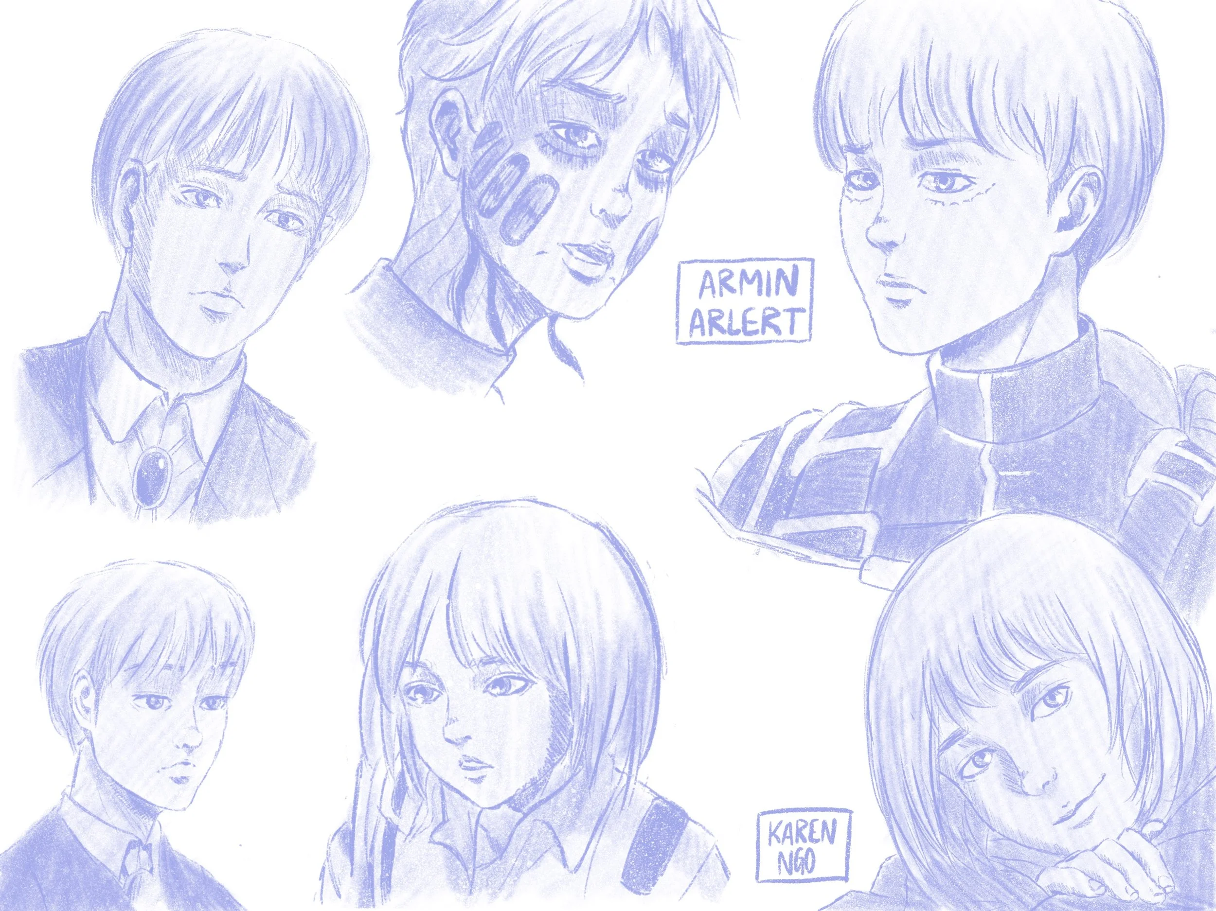
ATTACK ON TITAN
Digital Paintings, 2732 x 2048 px
In High School, one of my favorite animes was Attack on Titan, and I was so captivated by the music, characters, and storyline, that I just had to create a drawing for my favorite characters. Since I was not as advanced with digital art yet, I simply used a pencil tool to sketch out each character, and focused on shading, rather than coloring. This helped me to feel more comfortable with the application, and gave me more confidence to keep furthering my skills.
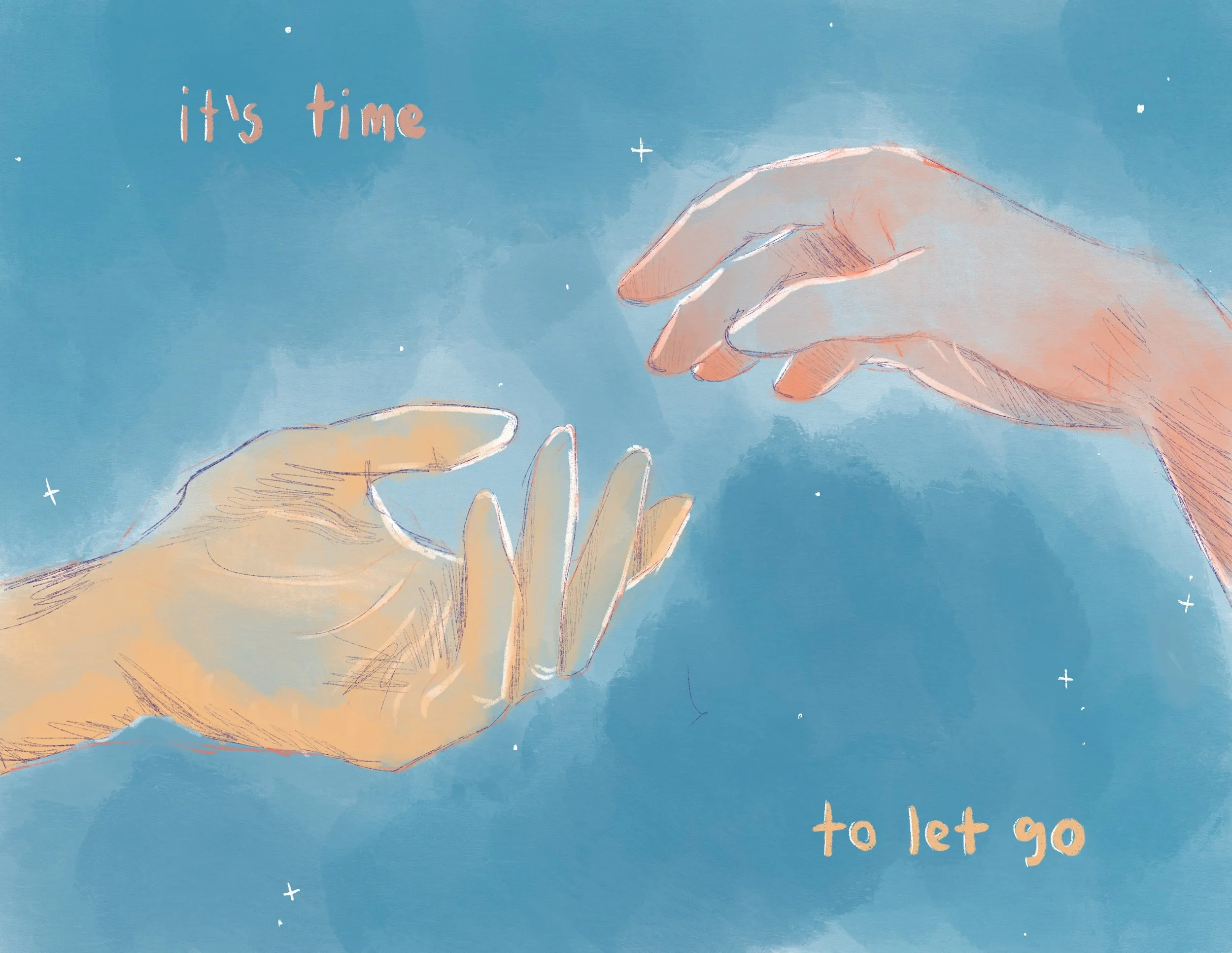
LETTING GO
Digital Painting, 11” x 8.5”
This was made after I broke up with my “first” boyfriend. I write that in quotations because we were in a relationship, but I don’t consider it as a real relationship considering we never got the opportunity to meet in person (I know, super weird), and we weren’t together for that long. After being with him, I realized that, although he was a nice guy, he wasn’t the right person for me, so I had to make the tough decision to end things. I felt really bad, but I knew that was the right decision. To help me cope with my feelings, I made a digital painting to show that I was letting go.
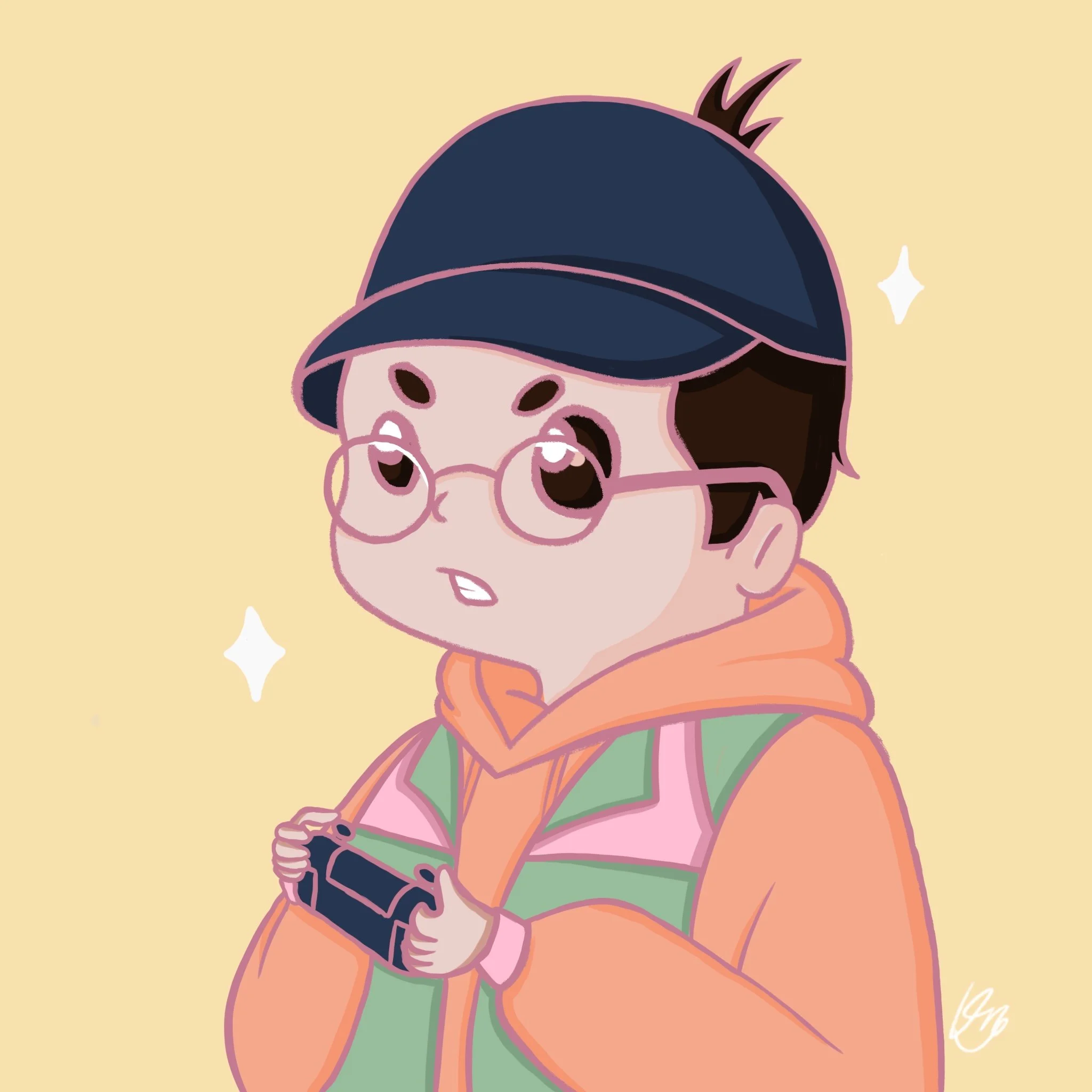
ITSZER0FPS
Digital Painting, 2048 x 2048 px
My brother started his streaming career 4 years ago, and asked me to create a profile picture that he could use across all of his social media so I was inspired to create this. He asked me to use these bright colors, and draw him in a cartoon style. My brother often wears a hat, and loves to play video games so I decided to draw him with those 2 things. Those are the things I associate with him the most, so I used them to reflect his personality and appearance.
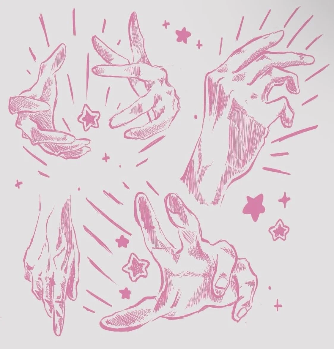
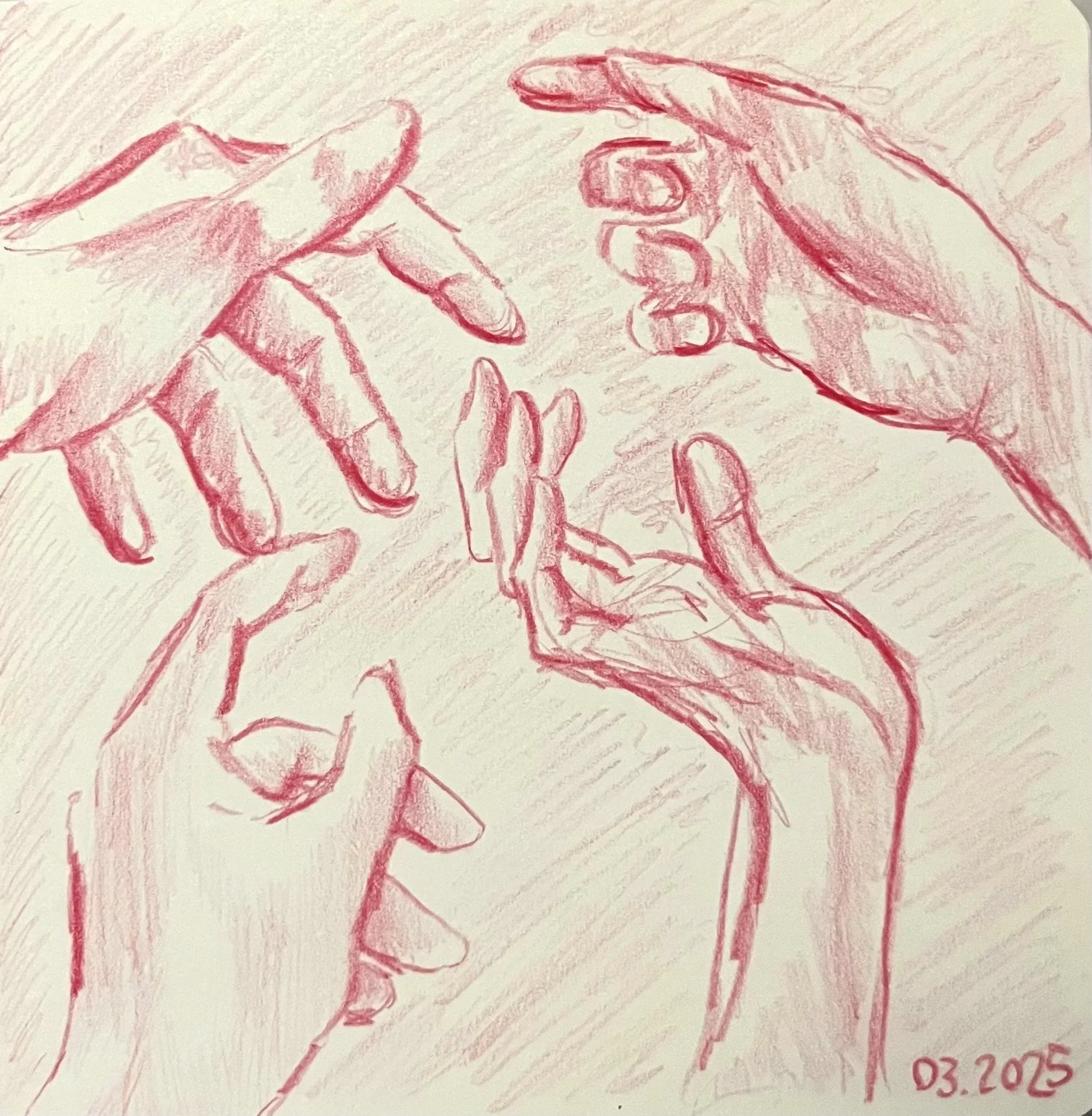
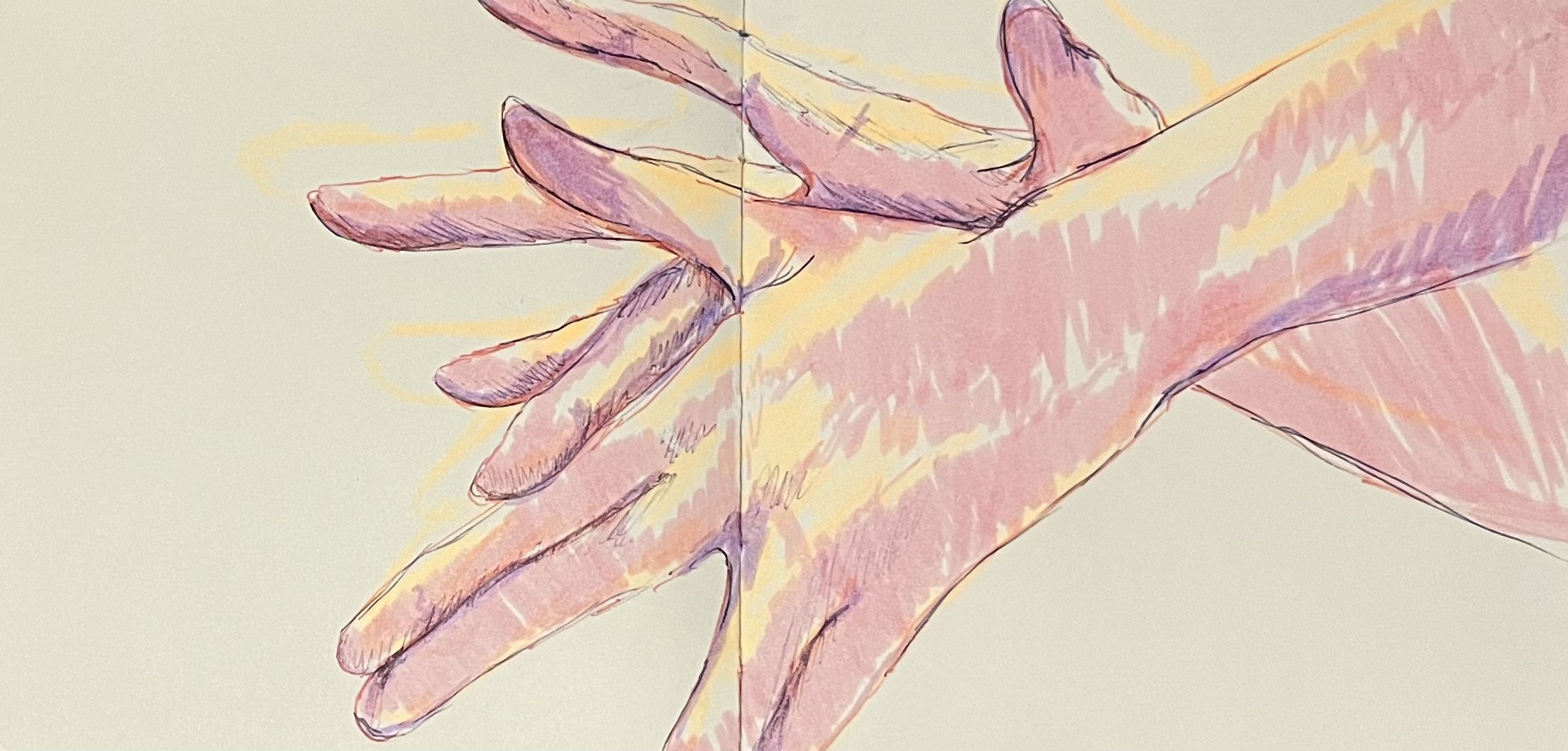
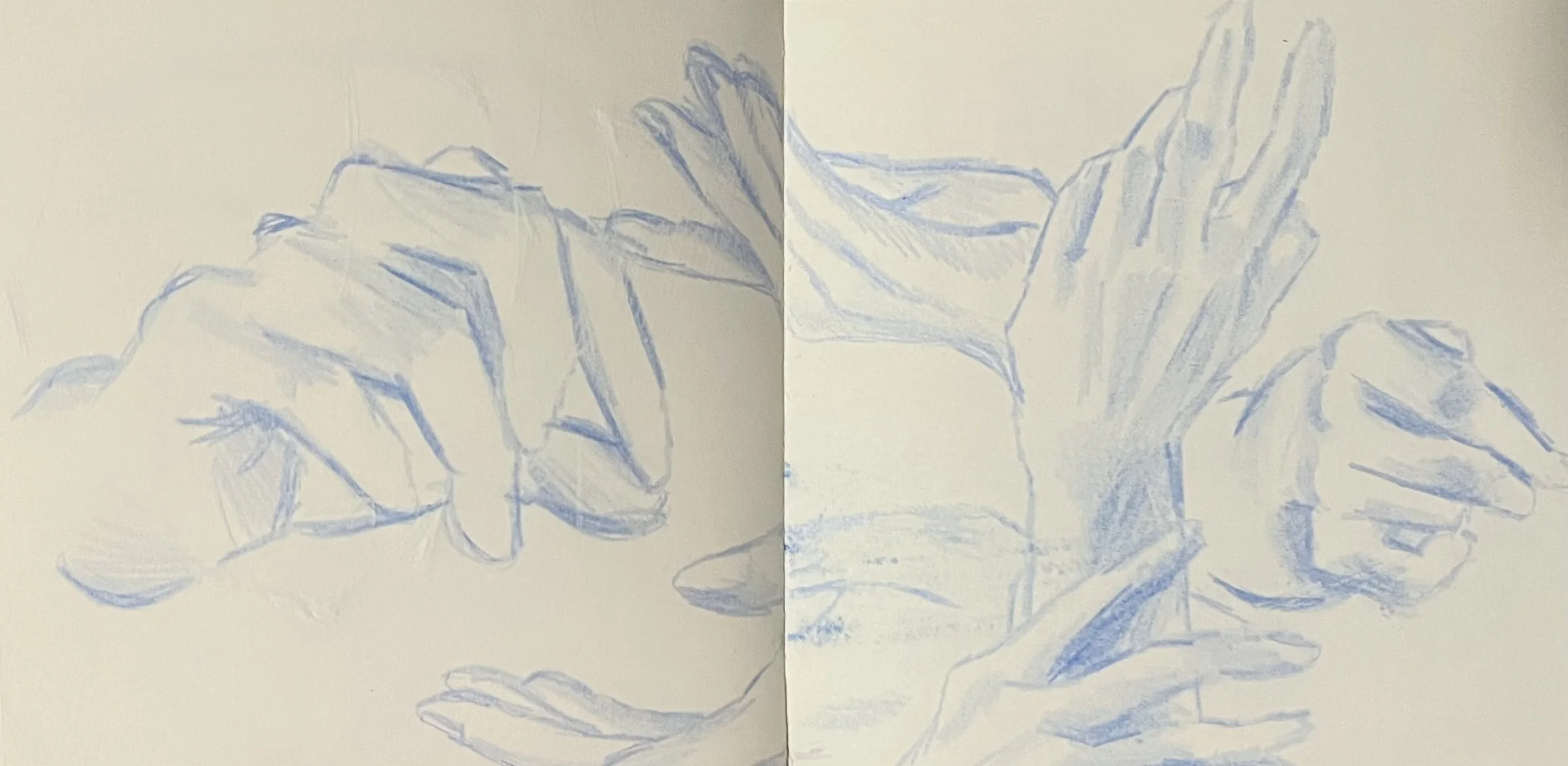
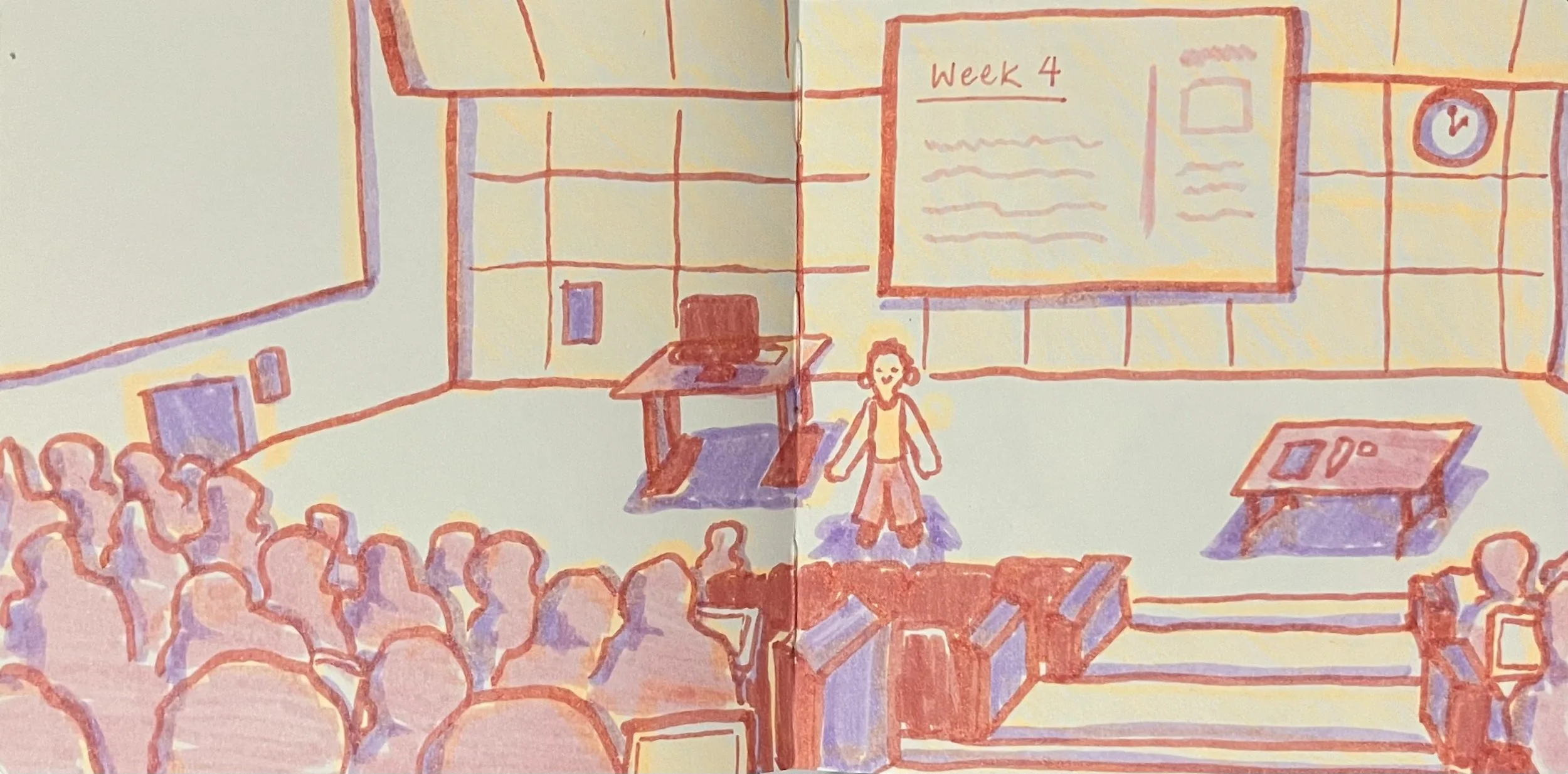
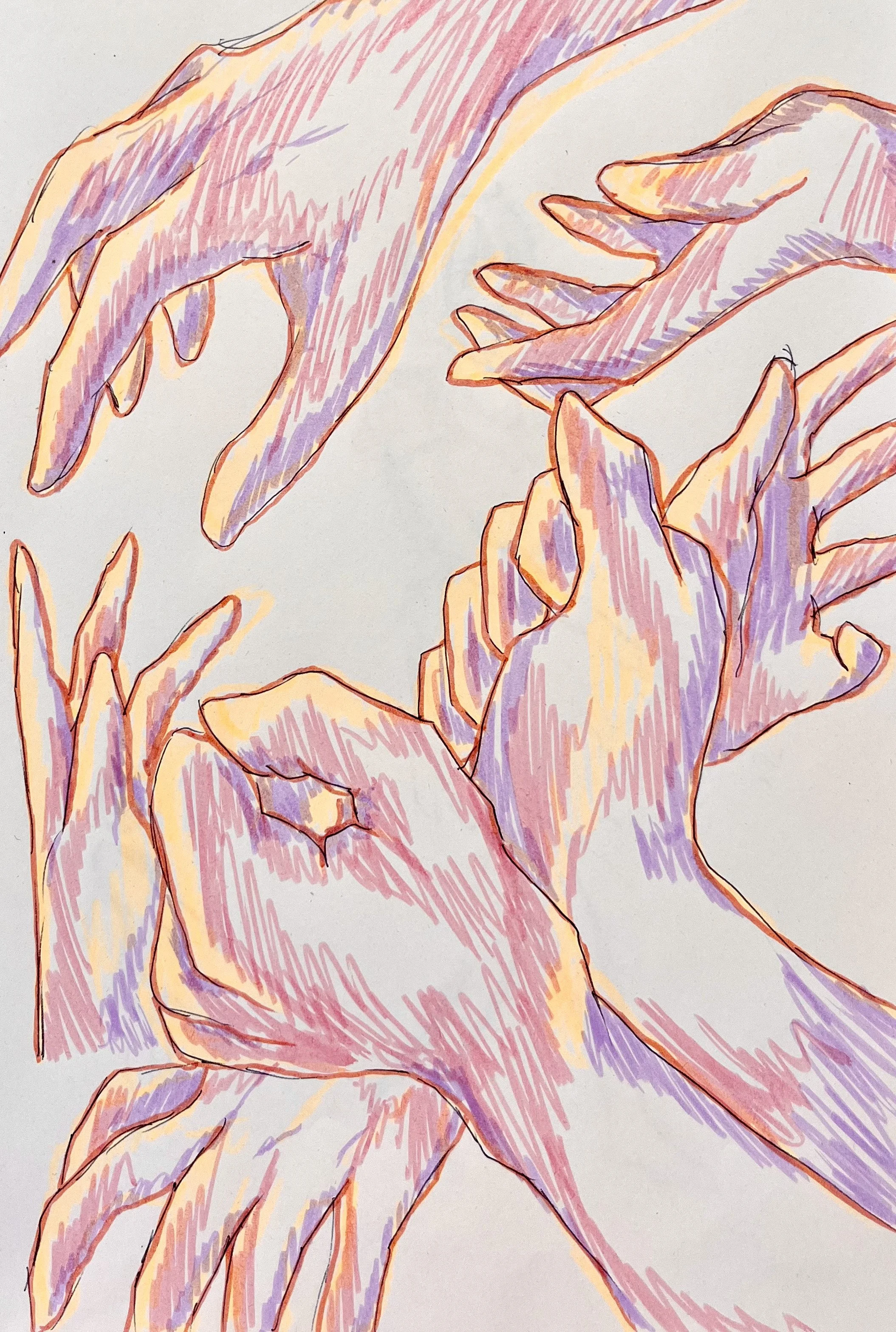
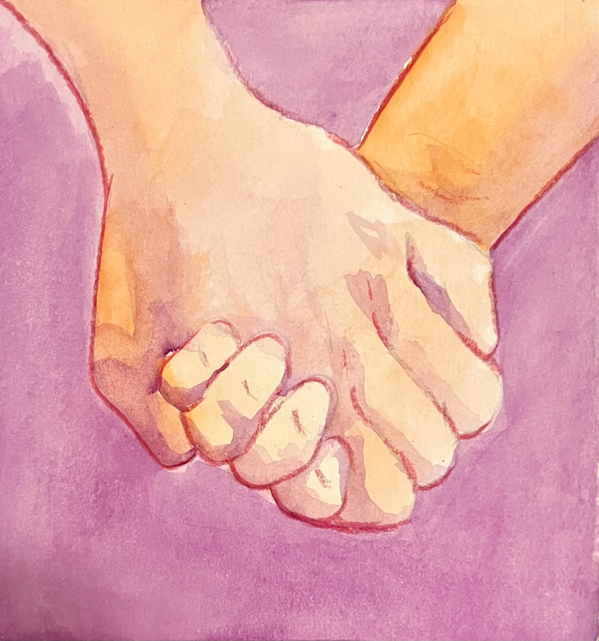
HANDS
Digital Painting, 2732 x 2048 px
I had just started my first year of university, and I was taking a mandatory business class. If I’m being honest, I was bored out of my mind, and I could not stay awake for the life of me, so I opened Procreate, and started drawing to pass time and to stay awake. I often go on Pinterest to look for references, so I found images of hands and drew them. I love using one color to create a consistent drawing, and I think it stands out pretty well against a white background.
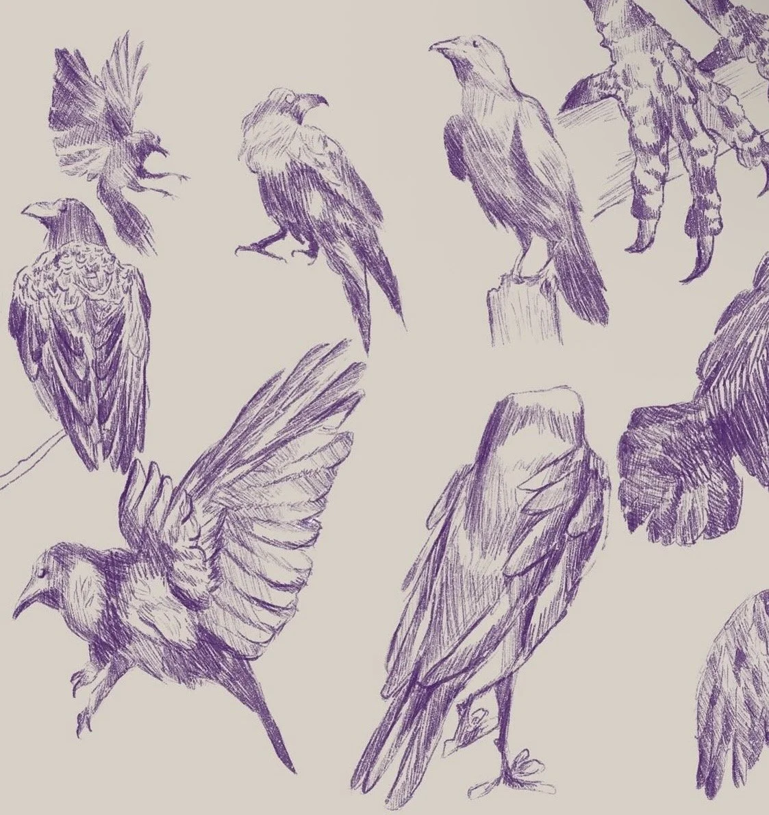
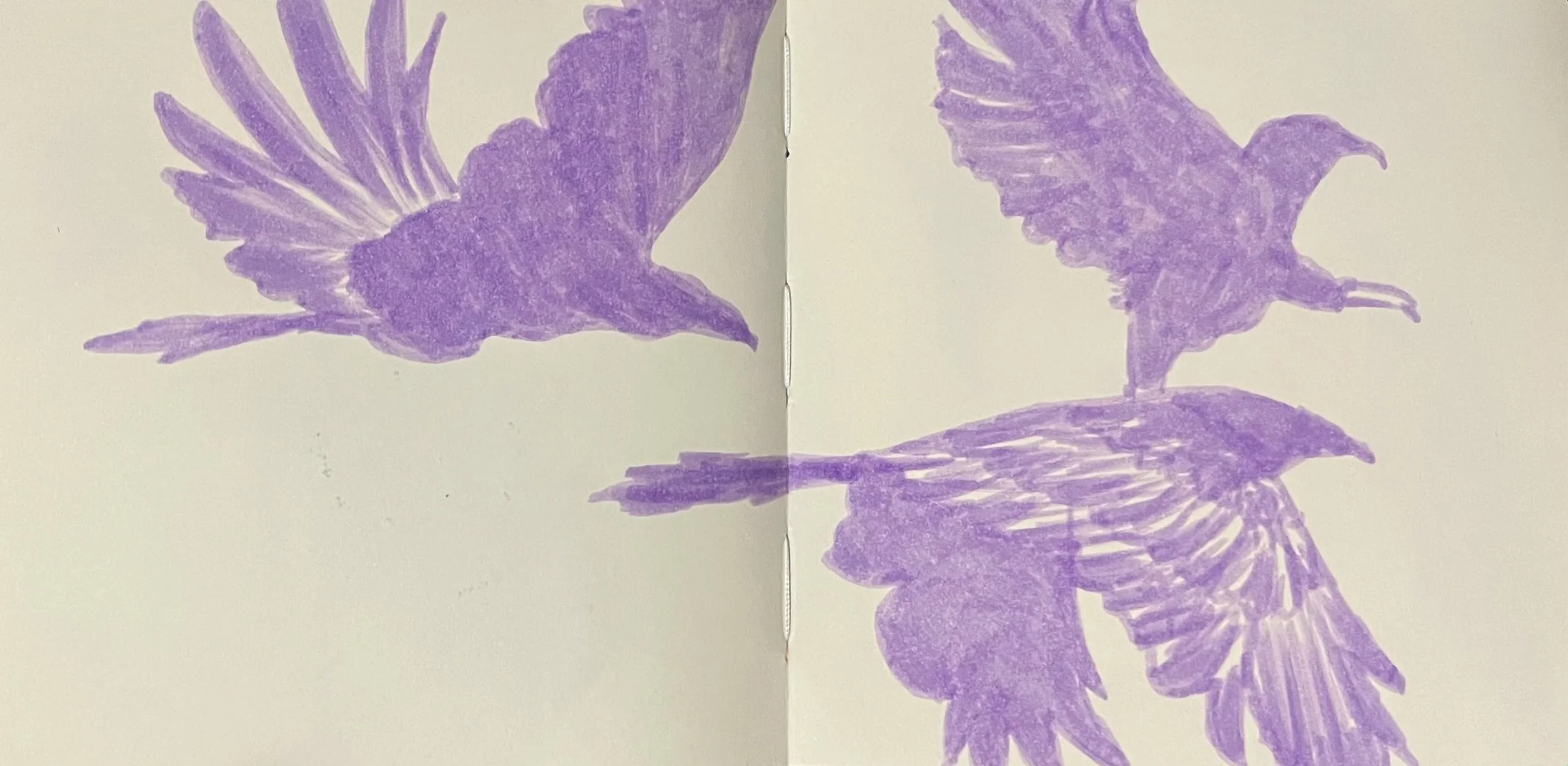
SOARING
Digital Painting, 2732 x 2048 px
Once again, I was taking a “digital art class,” and I was fighting for my life to stay awake. I had taken this class because I thought it would be focused on digital illustration, but instead, it was about different technologies that creators use. There was a lot of discussion about artificial intelligence, and artists who use digital tools to create displays for museums, and public spaces. I personally did not enjoy this class, so I decided to draw to pass time. I drew these birds as a symbol of how I wish I could be free, and fly away since I did not want to be there.
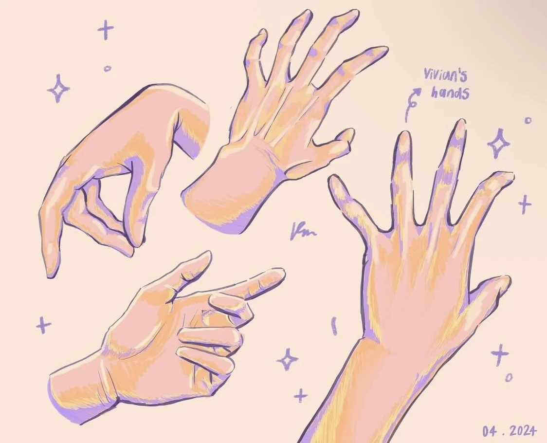
VIVIAN
Digital Painting, 2517 x 2048 px
If you couldn’t tell by now, I absolutely love to draw and paint hands. To practice, I often ask my friends to send me pictures of their hands in various poses so I can draw them. I asked my friend Vivian to send me photos of her hands, and since she is an artist herself, she knew exactly how to pose her hands to make them look dynamic and visually pleasing. I had so much fun creating this drawing of her hands since I was experimenting with a new color palette, and I was pushing myself to make the hands look more realistic. I often only sketch hands, so coloring them realistically took more time, but I was very happy with the result.
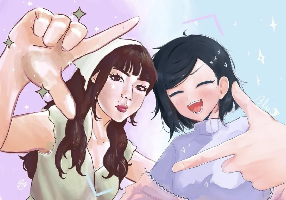
PICTURE FRAME CHALLENGE
Digital Painting, 2892 x 2048 px
With the same friend I mentioned above, we decided on this picture frame art challenge to collaborate on. We thought it would be cool if we both drew ourselves, but in our own art styles to show the contrast and difference between them. She added little doodles surrounding her, and I did the same, but in my own style. This was challenging to make because I often struggle to draw myself, so this took me quite some time, but with persistence, I was able to complete this in time to merge it with Vivian’s drawing to create a finished digital drawing.